
Ripper Paper
Superior Aussie-made household goods.
Project Overview
Industry
Retail & Consumer Goods
Location
Adelaide, South Australia
Deliverables
• Branding
• Packaging
• Social Media Templates
The business
Ripper Paper is an Australian-made household goods business on a mission to bring premium, eco-friendly toilet paper and tissues to every home in the country. Built on local pride and a genuine commitment to sustainability, Ripper cuts through the noise with distinctly Aussie personality turning everyday essentials into a brand people actually root for. No imports, no fluff, just quality products made on home soil.
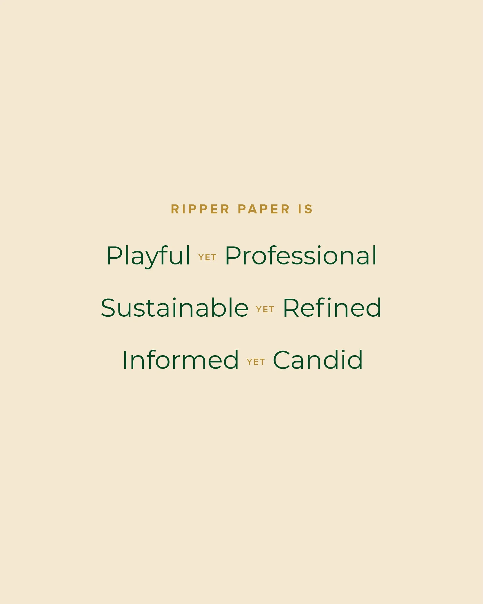
the CREATIVE DIRECTION
Playful yet Professional
Sustainable yet Refined
Informed yet Candid
Case study
The Making of Ripper Paper
The Business
Ripper Paper was founded by Candace and Ryan, two industry insiders with deep roots in the wholesale of paper goods and household essentials. Tired of a market dominated by overseas production — even the most patriotic-feeling competitors weren't making anything on home soil — they set out to build something genuinely, uncompromisingly Australian. Made here, owned here, no exceptions. As a brand identity designer working with small business owners, this was exactly the kind of purposeful, founder-led brand I love to get behind 🥰
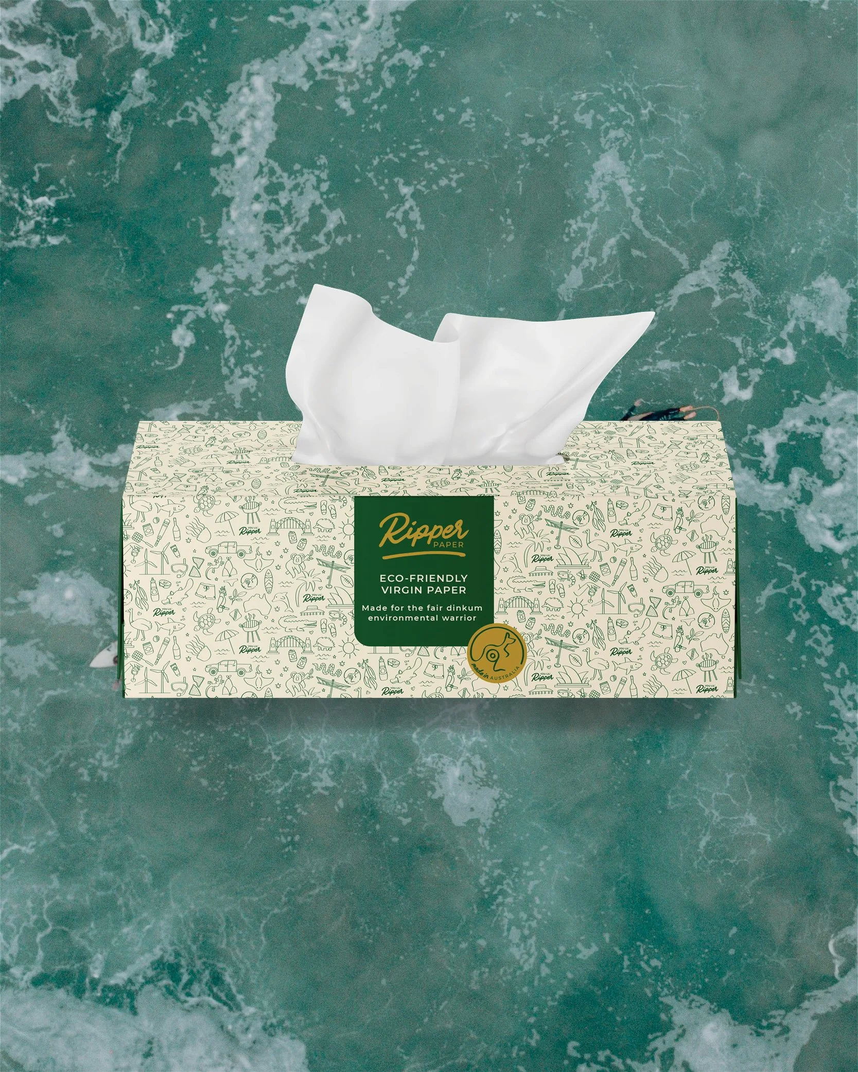
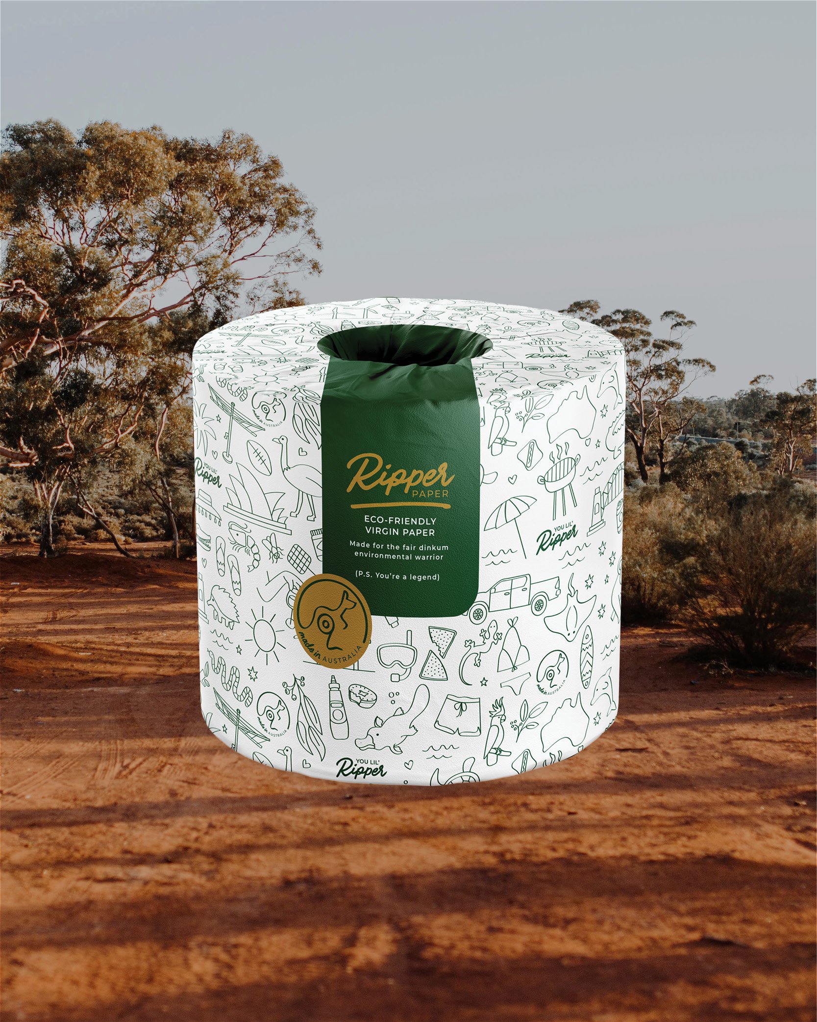
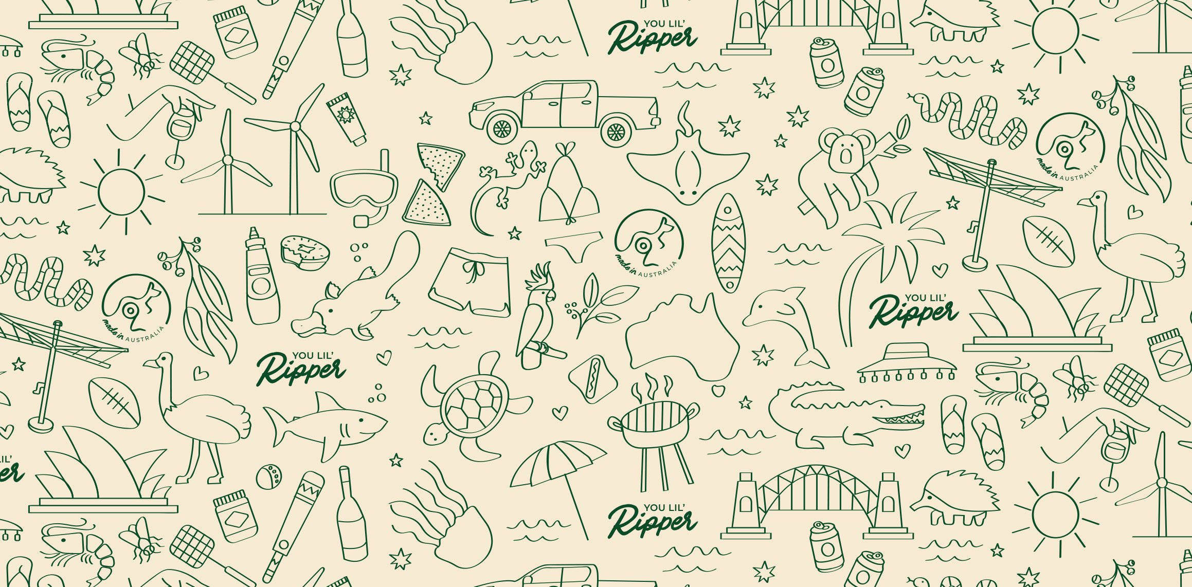
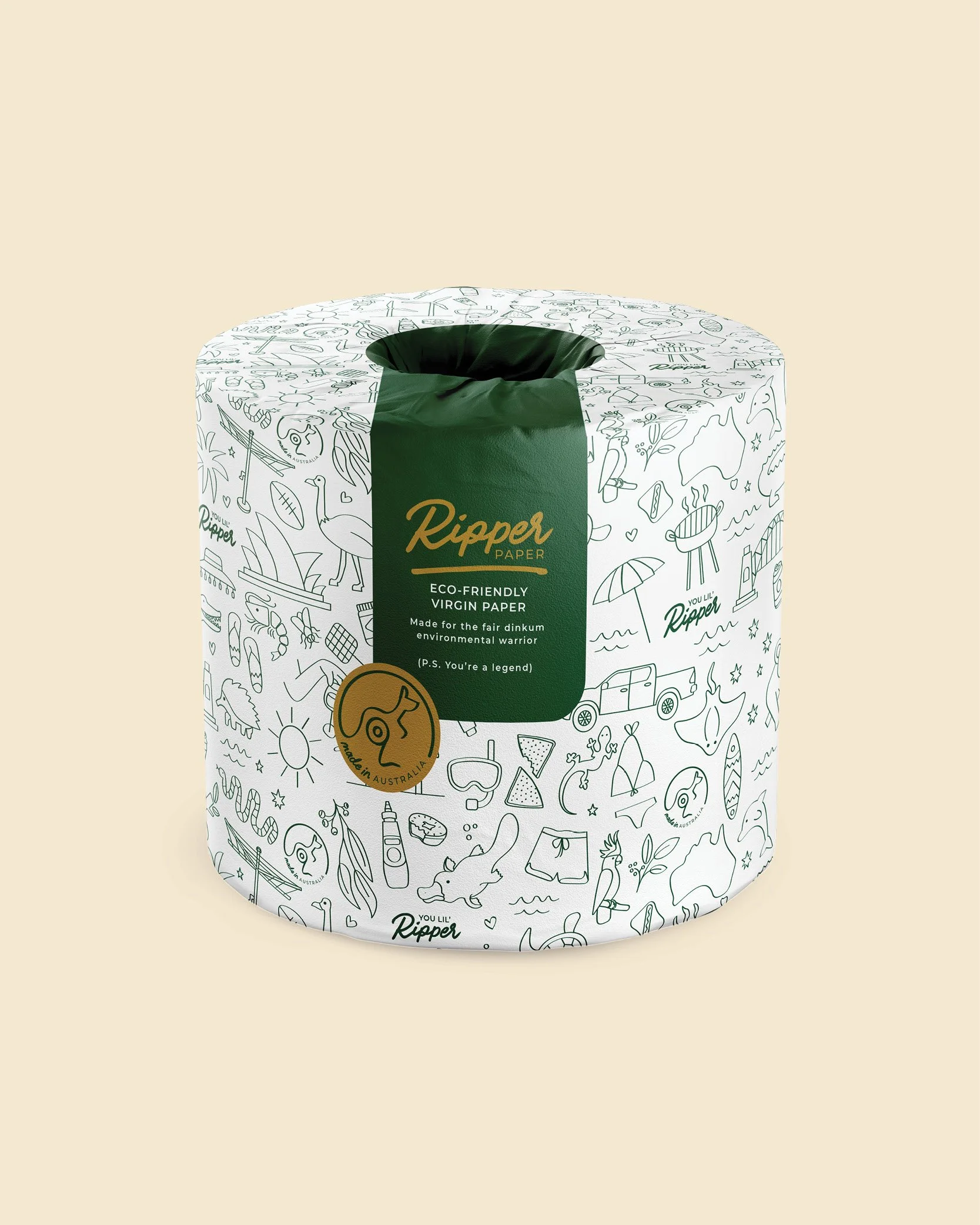
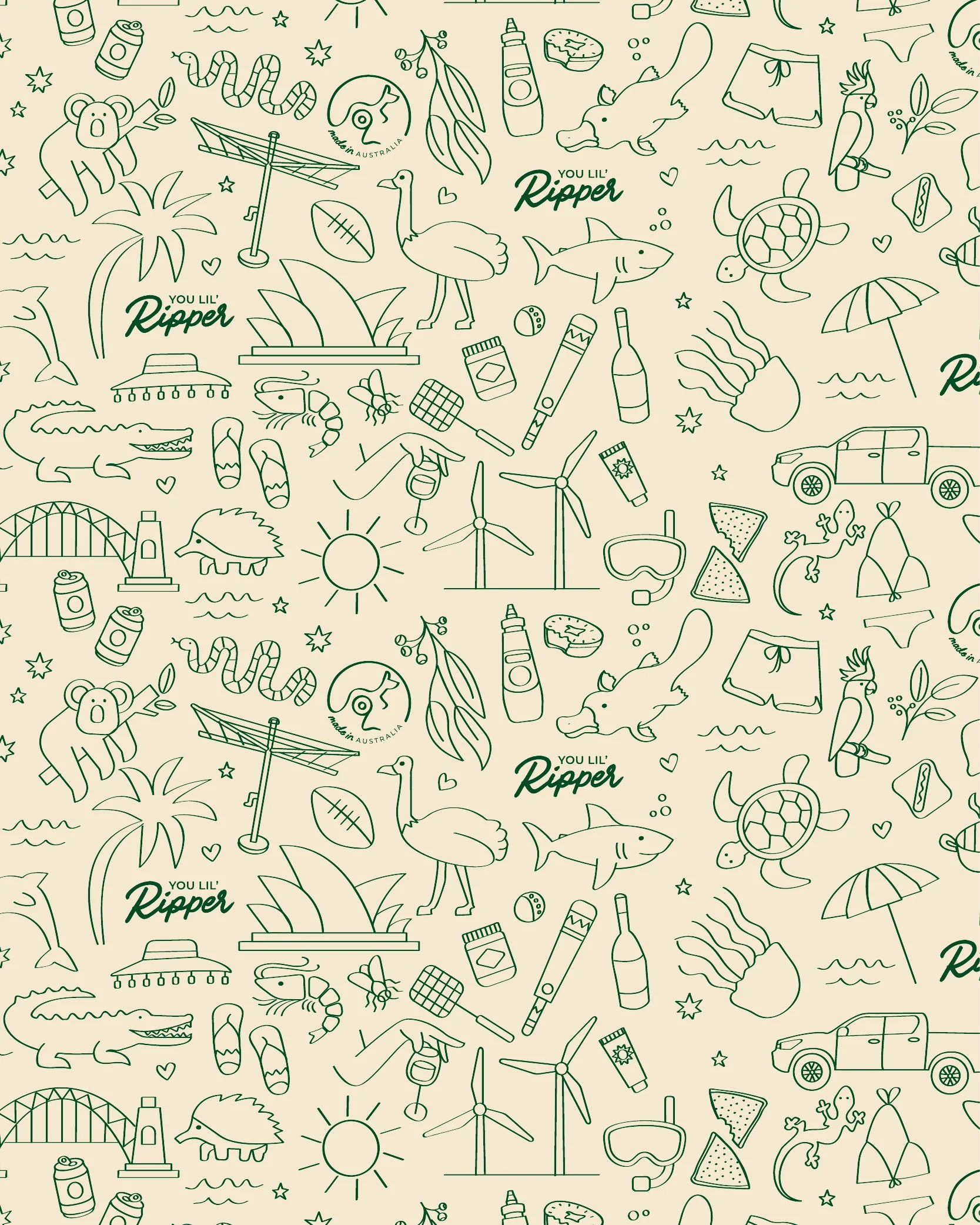
Packaging design presented the project's biggest hurdle. The original vision featured commissioned works by Australian artists — a natural extension of the brand's made-in-Australia commitment. Fully developed concepts had to be abandoned when local printing limitations ruled out full-colour packaging. Rather than compromise, the constraint became the brief. The solution was a richly detailed two-colour illustration, hand-drawn and loaded with iconic Australian imagery: fairy bread, Hills Hoists, utes, koalas, surfboards. Applied across both the toilet paper wrap and tissue box, it became one of the brand's most distinctive assets.
The Design Process
The brief was to build a brand as authentically Australian as the business behind it, without falling into the category's well-worn trap. Toilet paper brands love a pun, and the market knows it. Candace and Ryan's personality is warm, witty and unashamedly larrikin — but the brand needed to wear that lightly, feeling real rather than try-hard.
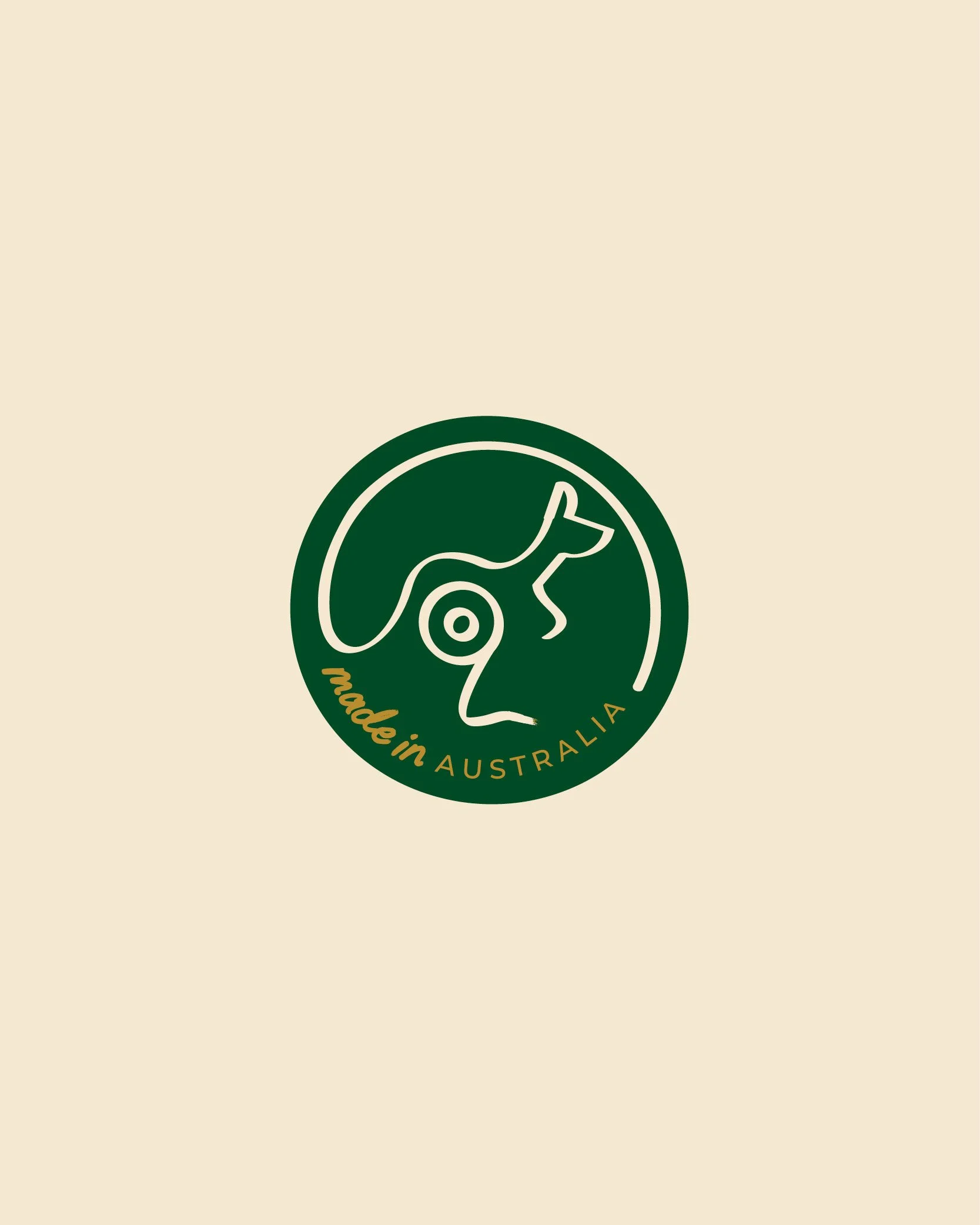
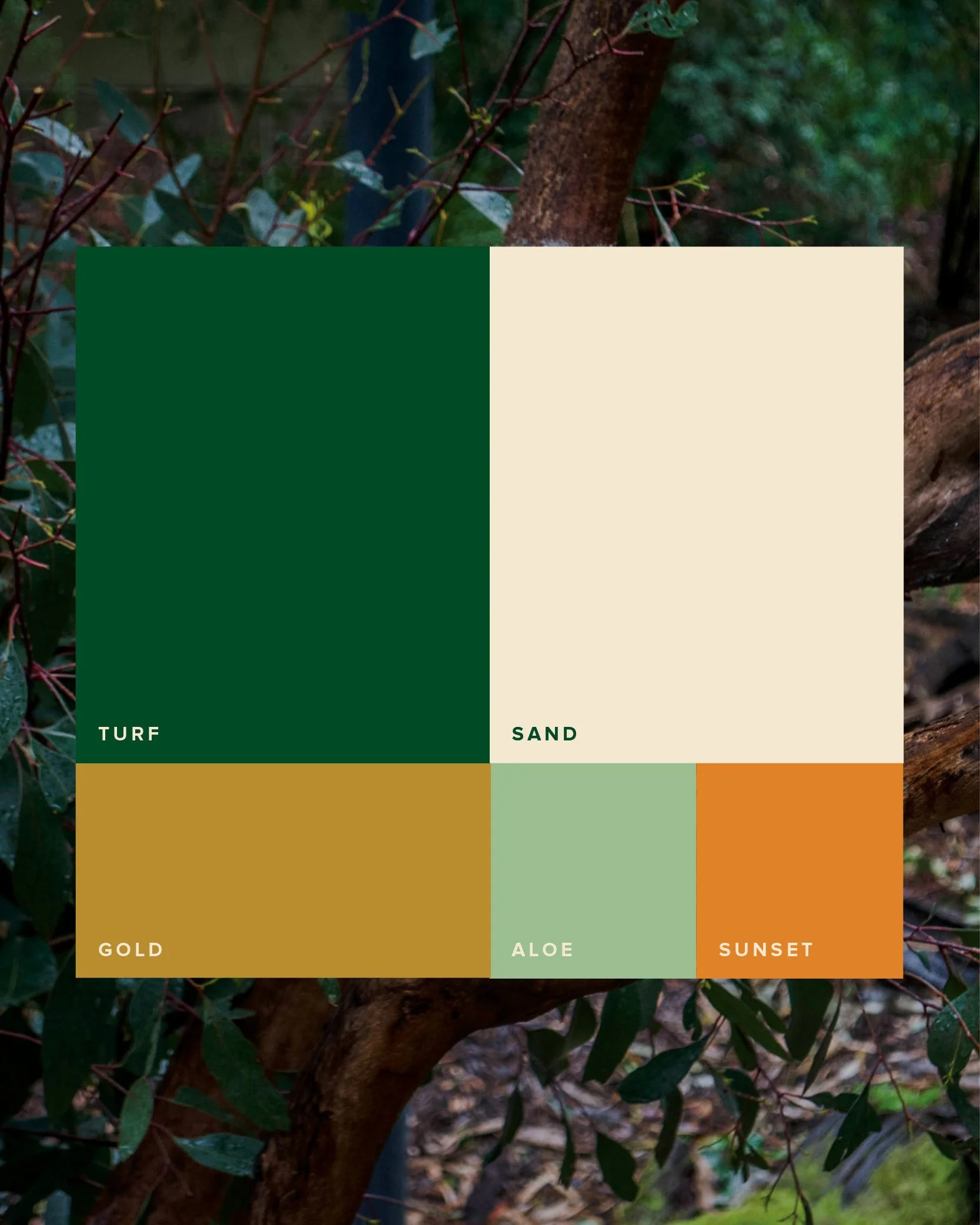
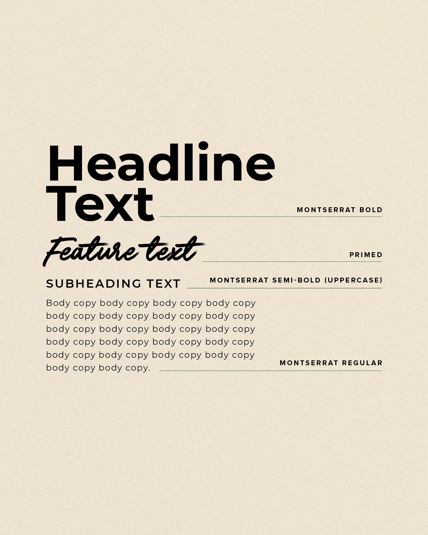
Green and gold were the natural foundation, deepened to a lush, rich tone and softened with cream to sit slightly more premium without losing approachability. The primary logo is typographic — brushstroke letterforms that feel handcrafted and personal, grounding the brand in the local, authentic spirit at its core. Supporting the logotype is a custom brand icon: a single-line kangaroo with a toilet roll worked subtly into the tail, nodding to the official Australian Made symbol while feeling entirely ownable. The consistency between the brushstroke type and the loose, fluid linework of the illustration ties the whole identity together.
The Result
The finished brand is a rare thing; one that genuinely reflects the people behind it. Distinctive, warm and unmistakably Australian, it holds together at every touchpoint.
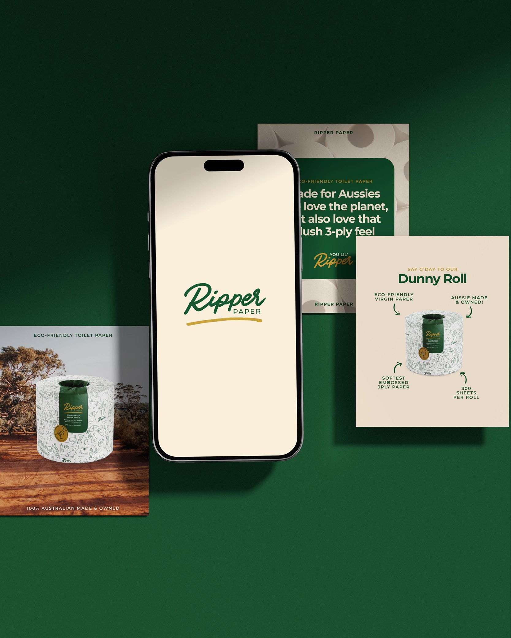
The completed brand kit included:
Primary logo
Secondary logo
Brand icon
Colour palette
Typography system
Following the brand development, we also rolled out:
Packaging design
Email signature
Social media templates
Press ads
Candace and Ryan have carried it forward with confidence, using the Instagram template suite to continue building their presence entirely in-house. Their web team applied the same assets across the site, creating a cohesive experience from packaging to digital. For any small business owner across Australia looking to build something real — Ripper is proof of what's possible when branding is done with intention. Ripper doesn't just look the part. It lives it.
Where to Next?