
Portfolio
Vector Built
Tailored construction solutions for commercial, residential, and development projects; fast, reliable, and proudly South Australian.
Project Overview
Industry
Building & Construction
Location
Adelaide, South Australia
Deliverables
• Branding
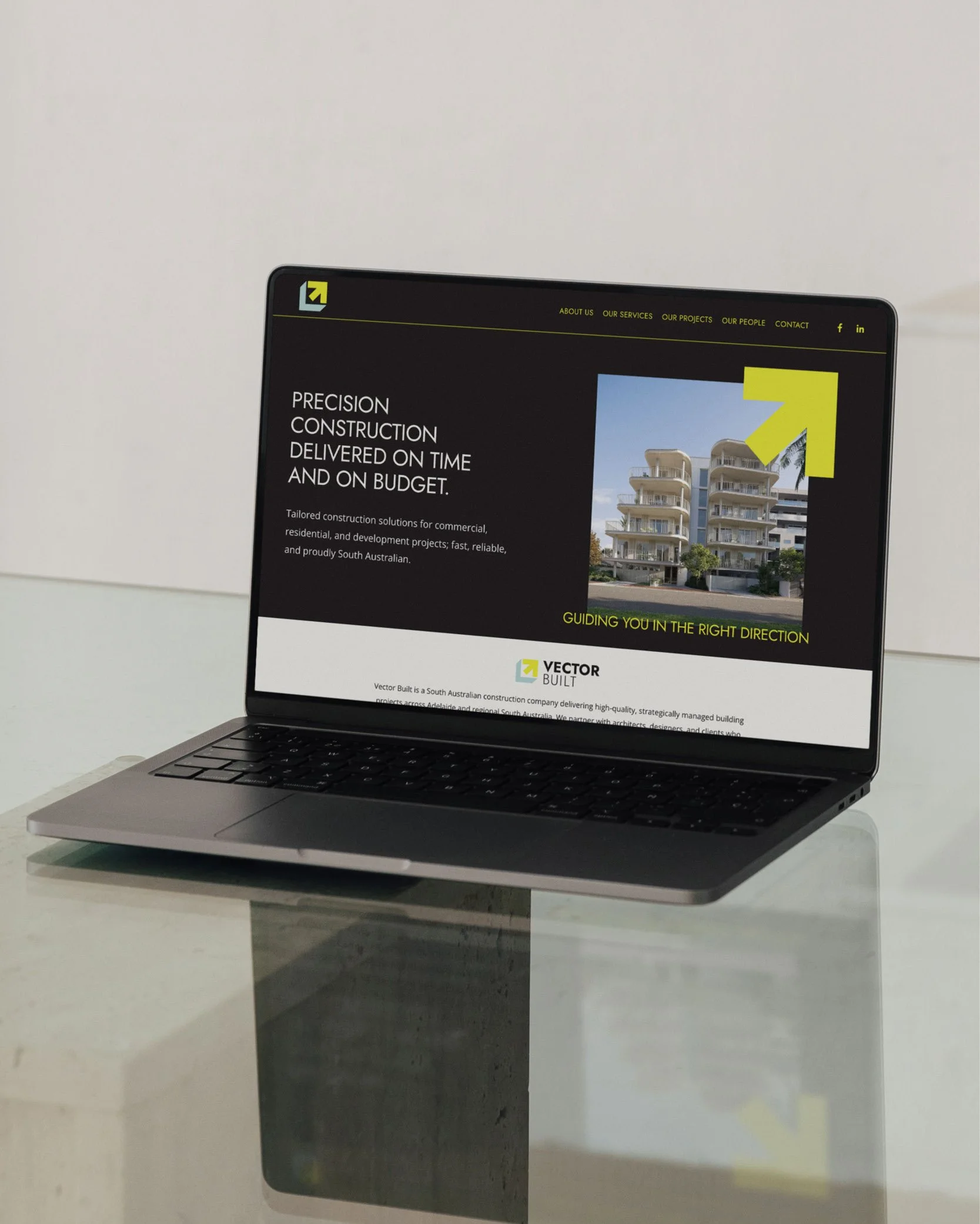
• Squarespace Website (view here →)
• Social Media Templates
• Presentation documents
• Advertising collat
The business
Vector Built is a South Australian construction company delivering high-quality, strategically managed building projects across Adelaide and regional South Australia. They partner with architects, designers, and clients who value precision, communication, compliance, and long-term performance. Every project is approached with smart planning and a commitment to efficient delivery without compromising safety or quality.
the CREATIVE DIRECTION
Dependable yet Agile
Experienced yet Innovative
Dynamic yet Grounded

Case study
The Re-Making of Vector Built
The Business
Ashley, Managing Director and Founder of Vector Built, was referred to me by a past branding client (Scott, Managing Director of SMFA). Having worked on the branding and websites of several architecture firms and builders across South Australia, I was really excited to help Ashley refresh his building company’s brand.
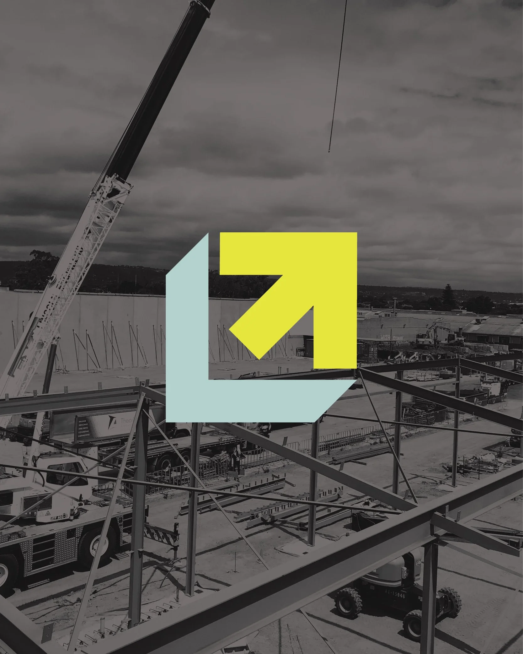
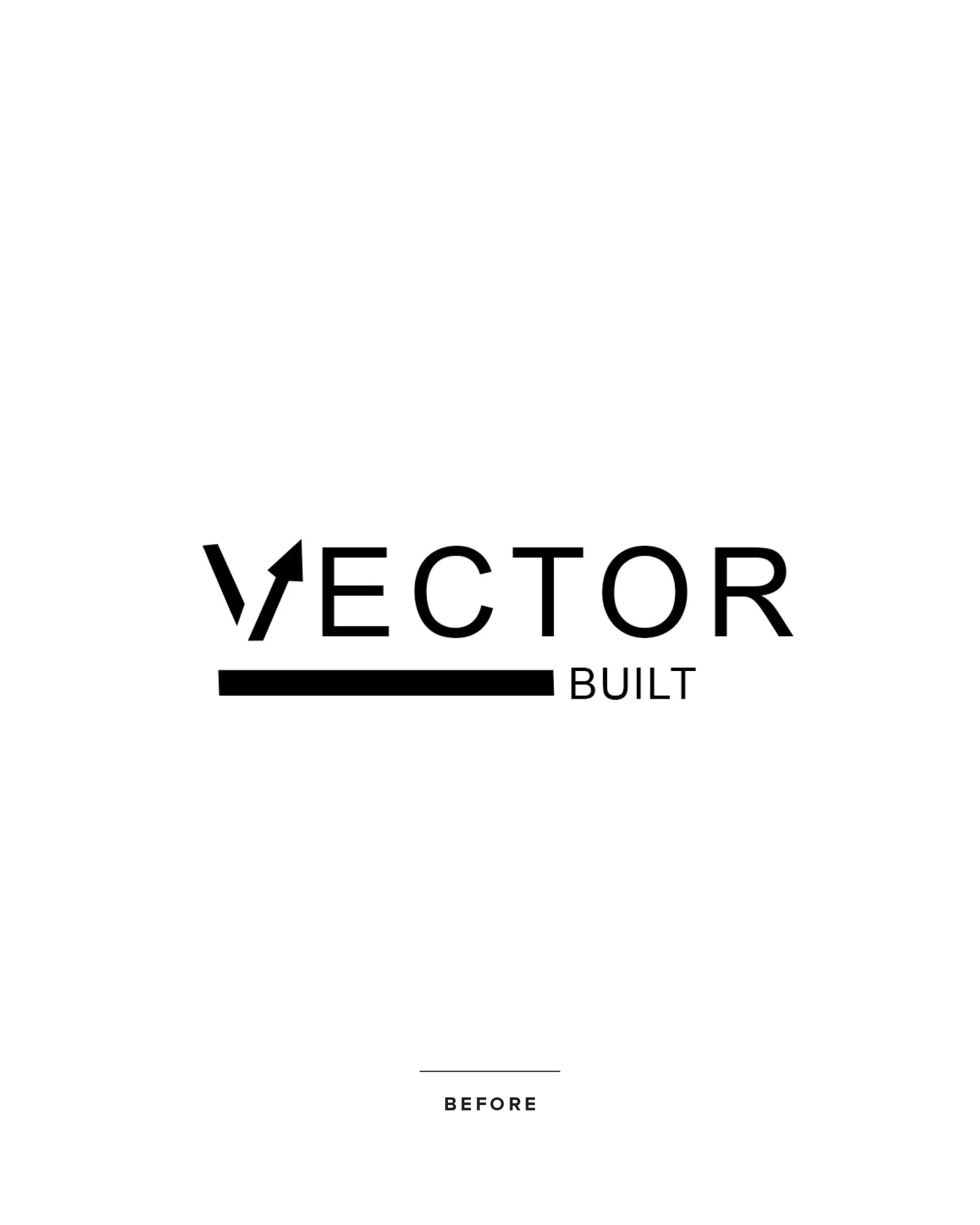
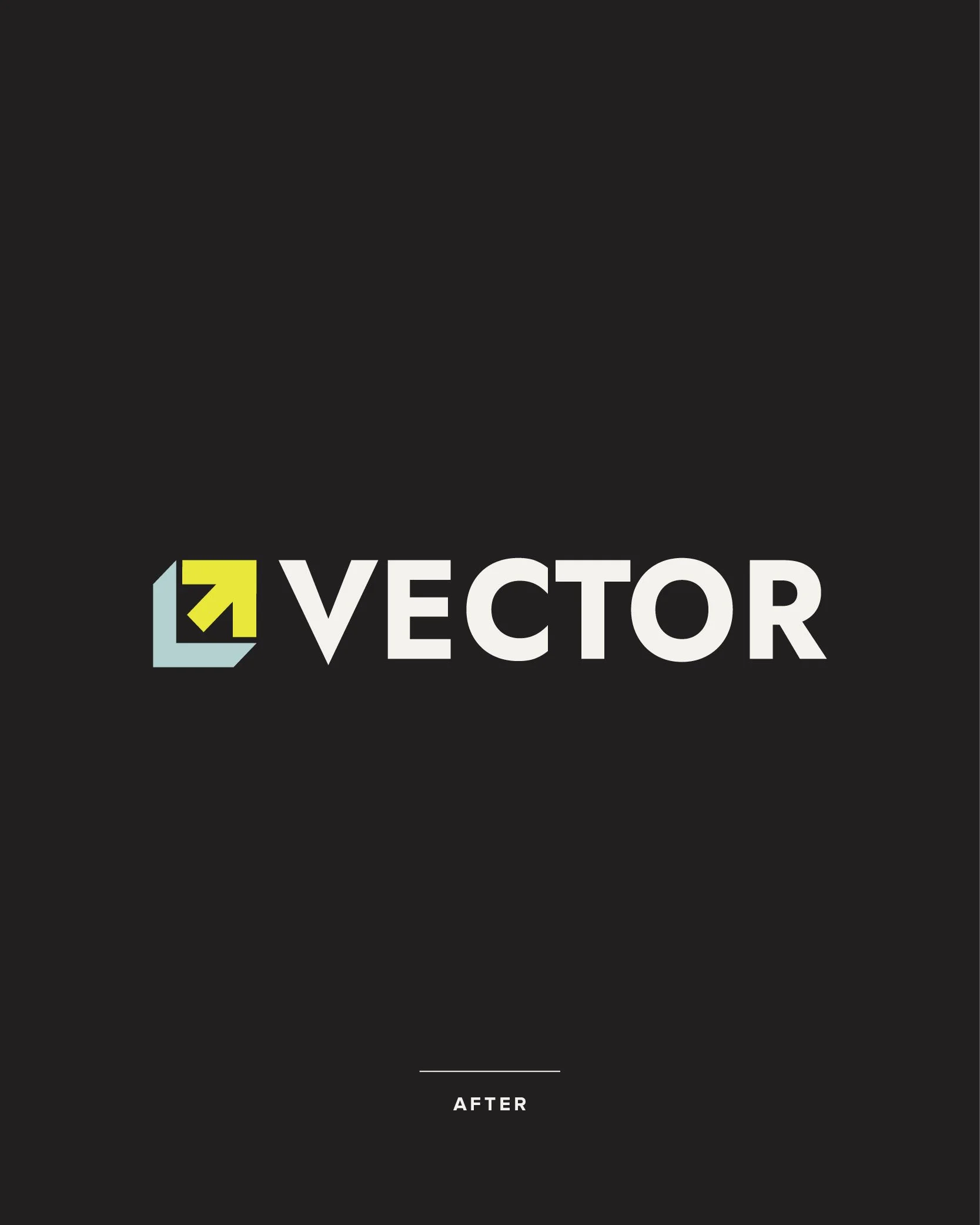
Vector Built already had strong foundations (pun intended). The existing logo was clean and modern and included a 45-degree “vector” arrow — a clever reference to the business name and a reflection of the company’s direct and efficient approach to building.
The brand concept itself was solid, but it had plenty of room to grow. The typography felt too light and lacked the strength needed to reflect Ashley’s experience and confidence in the building industry. The overall identity needed to feel bolder and more distinctive — something that would position Vector Built as a professional and established construction business.
One of the key challenges was the way the arrow had been incorporated directly into the typography. This is something I often see with DIY logos. While the idea can seem appealing, manipulating letterforms with graphic elements often reduces legibility and limits how the logo can be used across different applications.
Separating the arrow from the typography allowed it to become a strong standalone brand icon — something that could be used independently across signage, documents and digital platforms while building recognition for the business.
Ashley also mentioned that the arrow had never quite sat at a true 45-degree angle because it had been adjusted to fit into the letter V — a small detail, but one that had always bothered him. Restoring the accuracy of this key element became an important part of the redesign.
Rather than completely reinventing the brand, the goal was to evolve what already existed — strengthening the identity while staying true to the original concept.
The Design Process
As with all branding projects, the process began with Ashley completing a detailed branding questionnaire. This gave me valuable insight into the business, the industry, and how Vector Built had evolved.
I started by reviewing competitors within the South Australian building industry to understand the visual landscape. Several established builders were already strongly associated with particular colours, which helped identify opportunities for Vector Built to stand apart.
From there, I worked through Ashley’s description of the business to identify key themes and personality traits. Establishing a clear brand personality was particularly important, as this was something the existing brand didn’t fully communicate.
Using these insights, I explored visual directions built around bold, modern typography and confident colour choices.
A large part of the design exploration focused on refining the vector arrow symbol. I explored a wide range of ways to present the 45-degree arrow as a distinctive brand mark that could work both within the logo and as a standalone icon.
Three logo concepts were presented.
Ashley was immediately drawn to the first direction, but the colour palette sparked further exploration. Rather than uncertainty, this reflected a new awareness of the role colour could play in strengthening the brand.
After exploring several options, we ultimately came full circle and returned to the original palette — which we both agreed felt just right for Vector Built.
The Result
The final result was a bold and professional brand identity that retained the essence of the original logo while significantly strengthening its impact.
The completed brand kit included:
Primary logo
Secondary logo
Brand icon
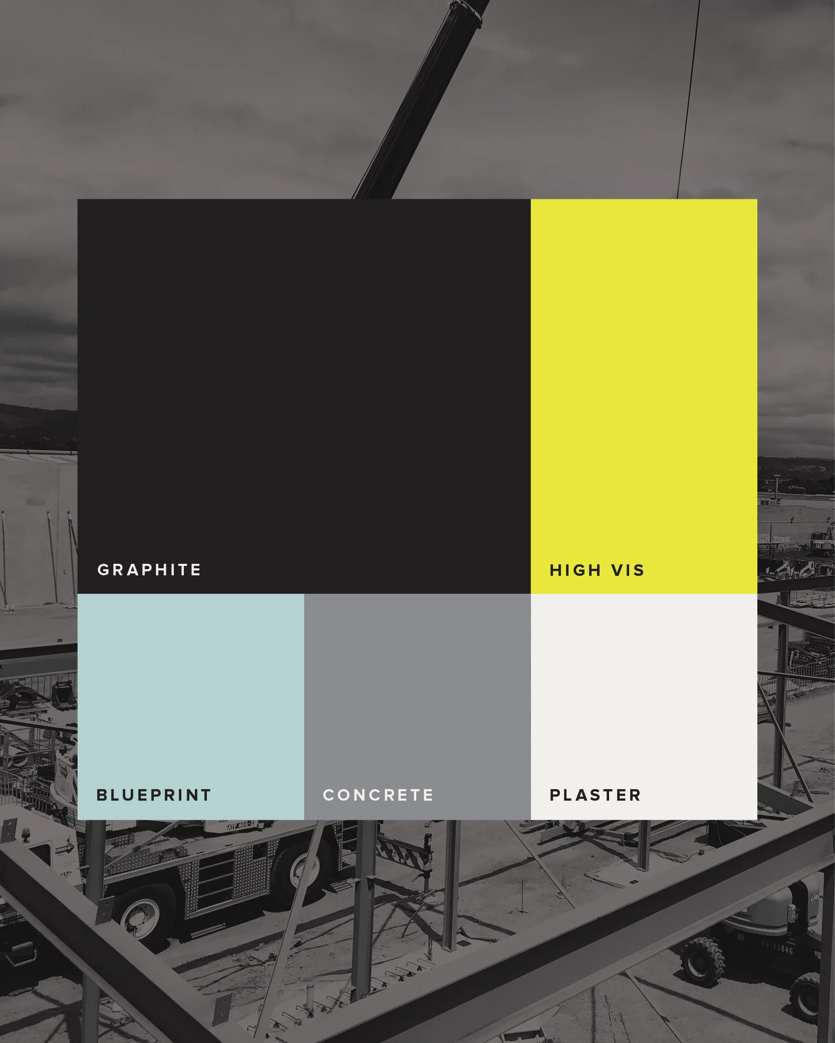
Colour palette
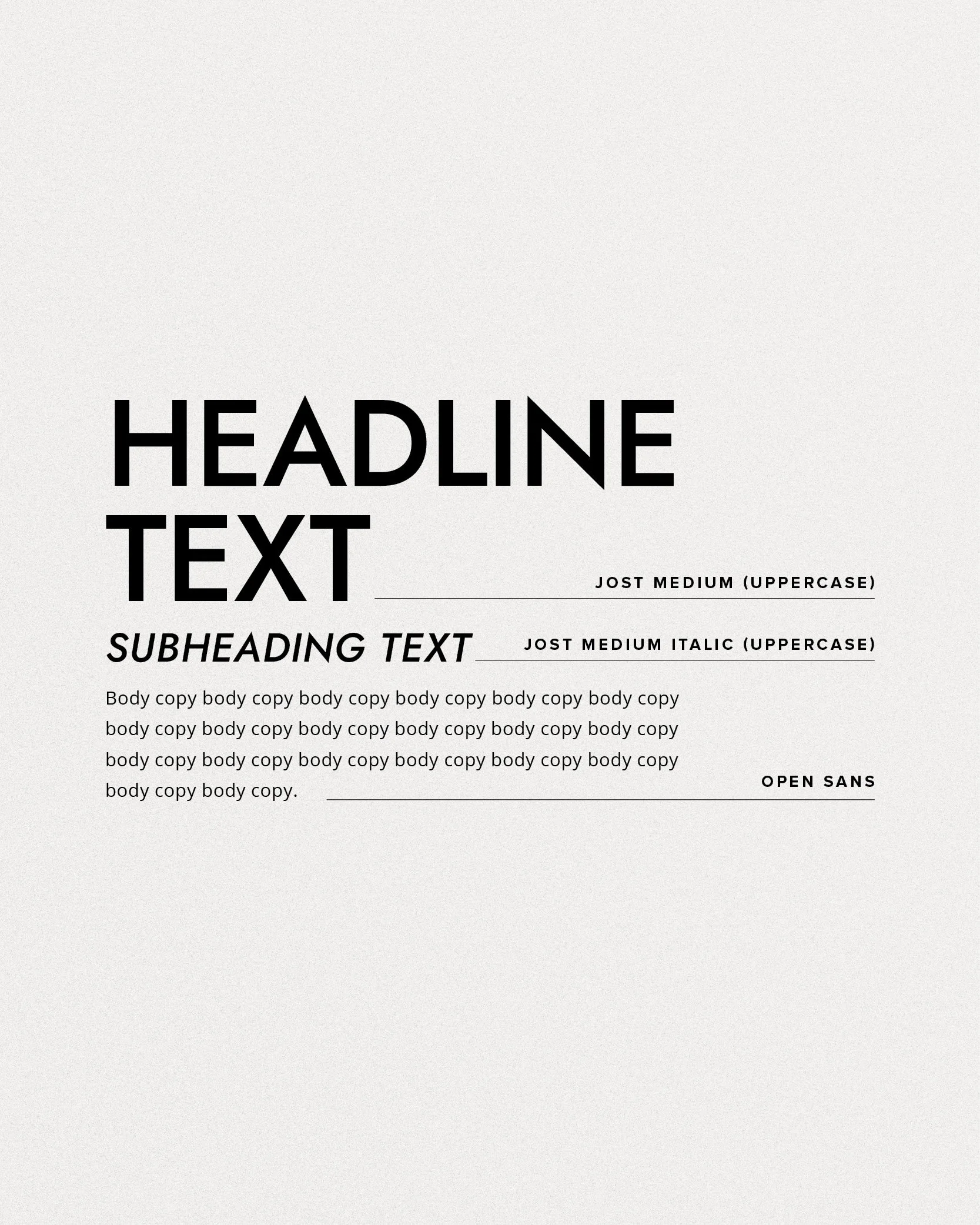
Typography system
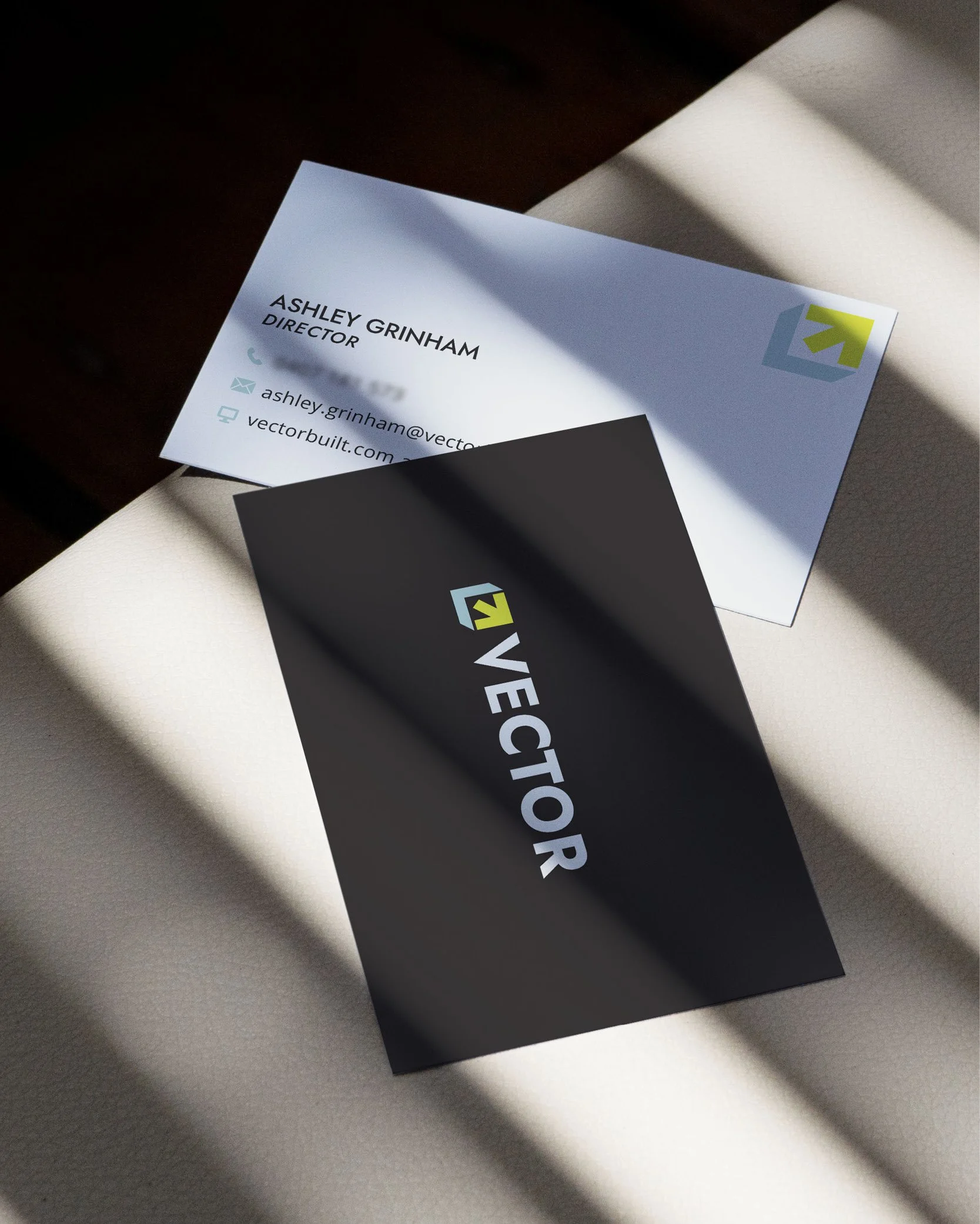
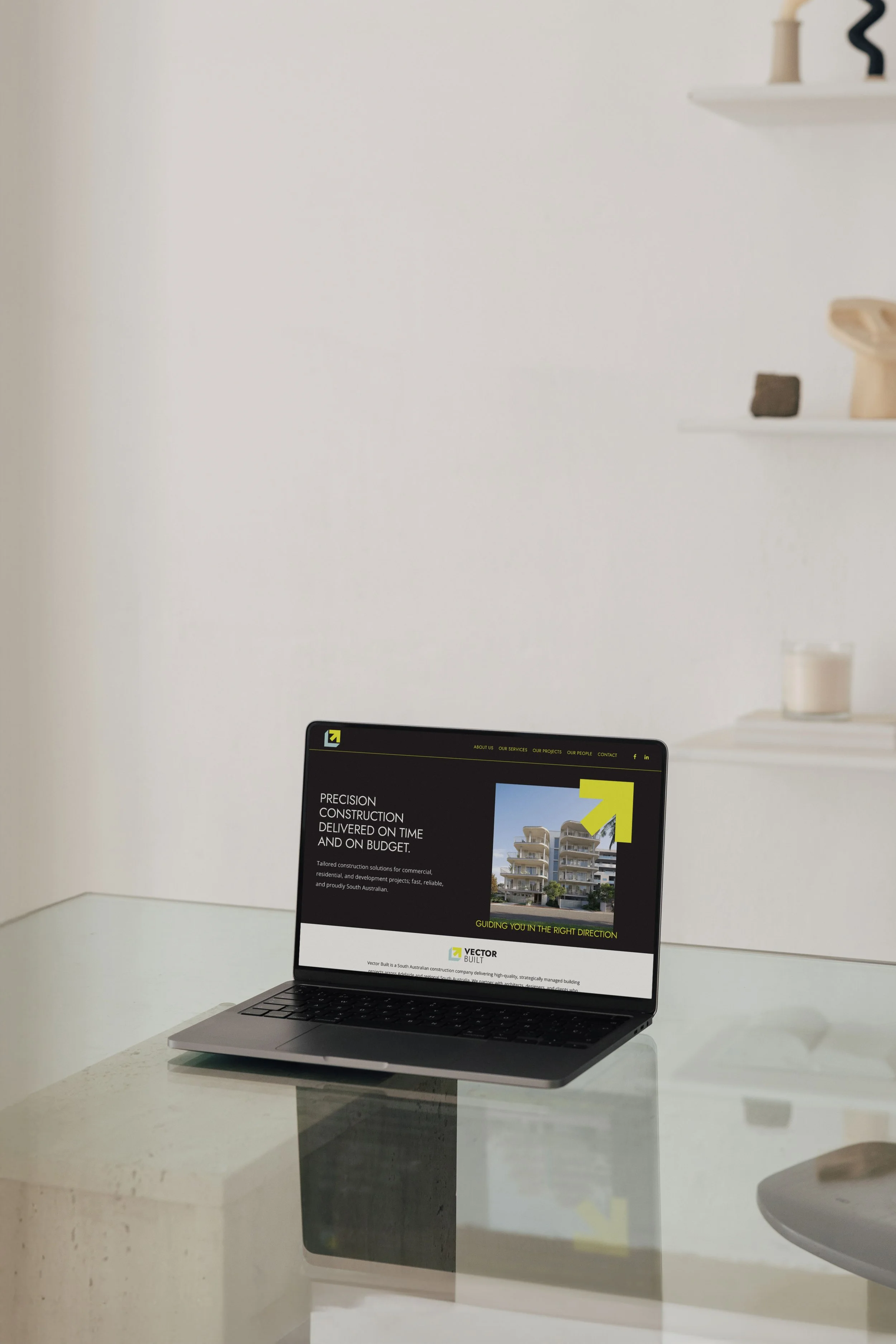
Following the brand development, I continued working with Ashley to roll out the new identity across a wide range of business assets.
Together we created:
Capability statement presentation
Project portfolio template
Business cards
Email signature
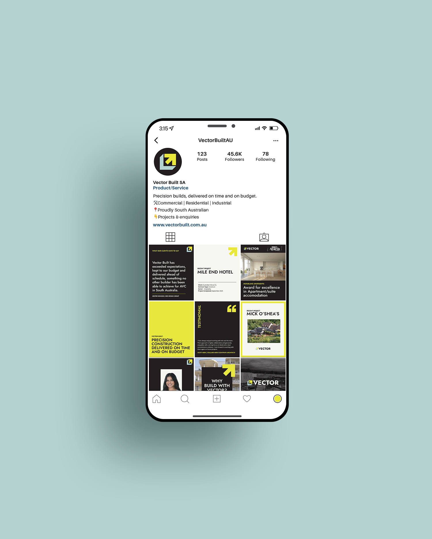
Squarespace website
Social media templates
Where possible, artwork was converted into Canva templates so Ashley’s team could continue creating marketing materials in-house while maintaining a consistent brand.
Vector Built now has a distinctive and professional brand identity supported by a complete set of practical tools. The business is equipped to present itself consistently across every touchpoint — a strong foundation for continued growth.