
The Making of RMW Coaching
The Business
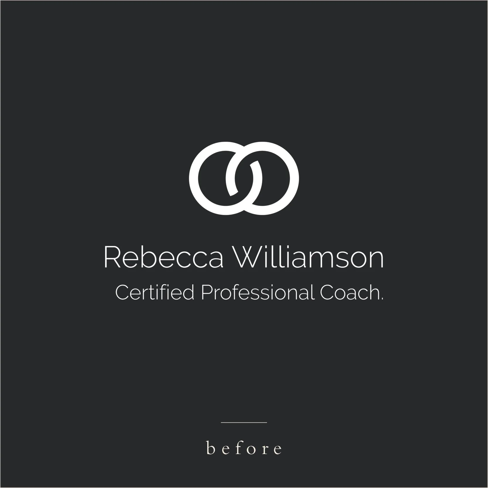
Based in Hong Kong, Rebecca is a certified professional life coach, specialising in pre and post-natal women. Since 2018 Rebecca had been building her coaching practice around her clients with a focus on their career aspirations and how to create paths to live more fulfilled lives. After a few successful years, Rebecca realised her brand needed an overhaul to better align with the professional business she had built and the vibrant community of women she had developed.
The Design Process
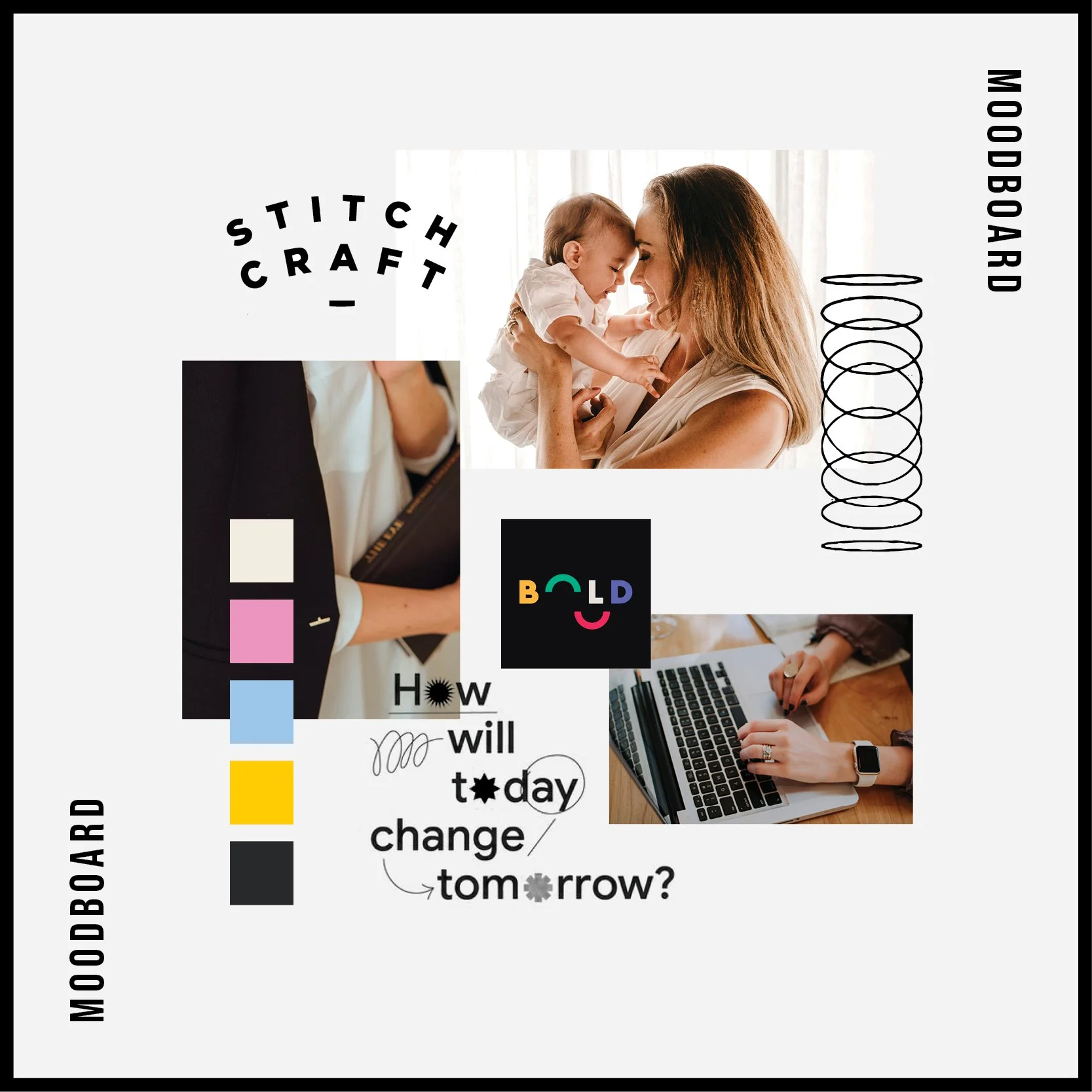
Rebecca’s original brand was clean and simple, which was a great starting point. However, it lacked distinction and personality.
Based on our introductory discussions, and through Rebecca’s responses to the initial brand questionnaire, it was clear that Rebecca did not want the brand to be based on her personality. Rather, she wanted her brand to inspire the women she works with - she wanted it to embody the spirit of the women they strived to be.
So, rather than clean and simple, the brand needed to be bold and vibrant. In the Creative Direction process, I showed Rebecca how we could achieve this sense of energy and vibrance through use of typography, colour and shape.
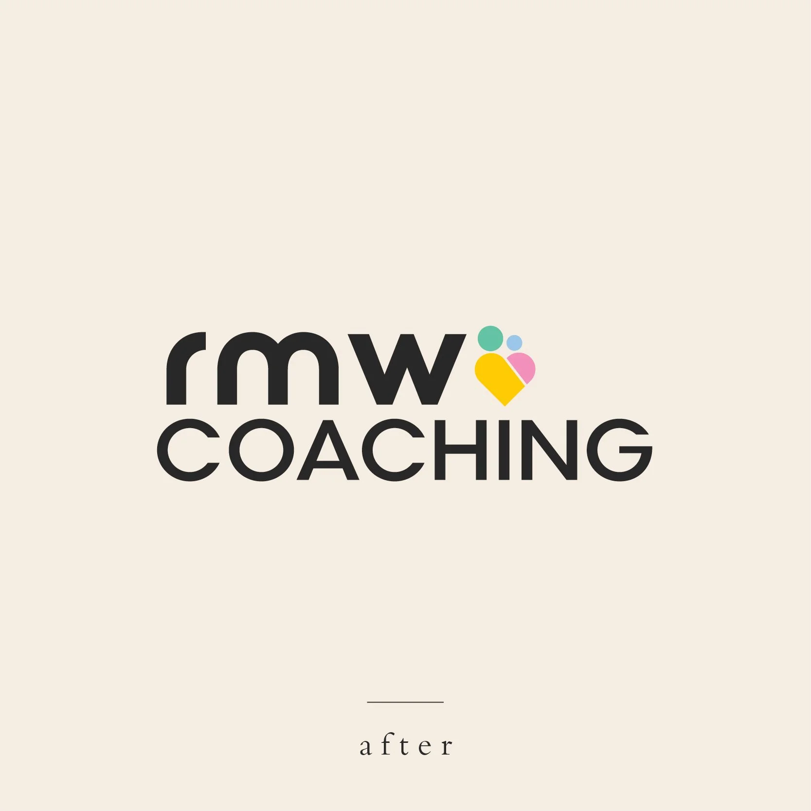
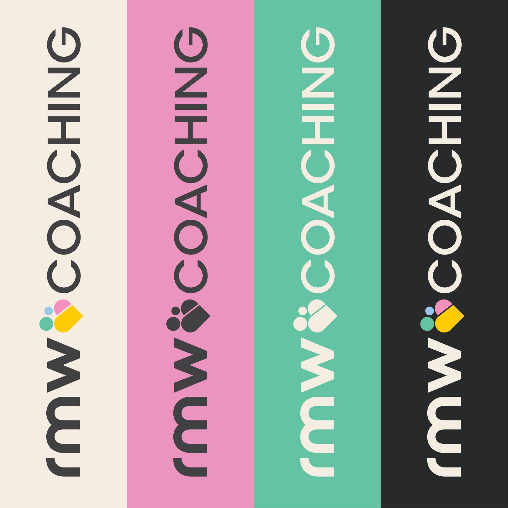
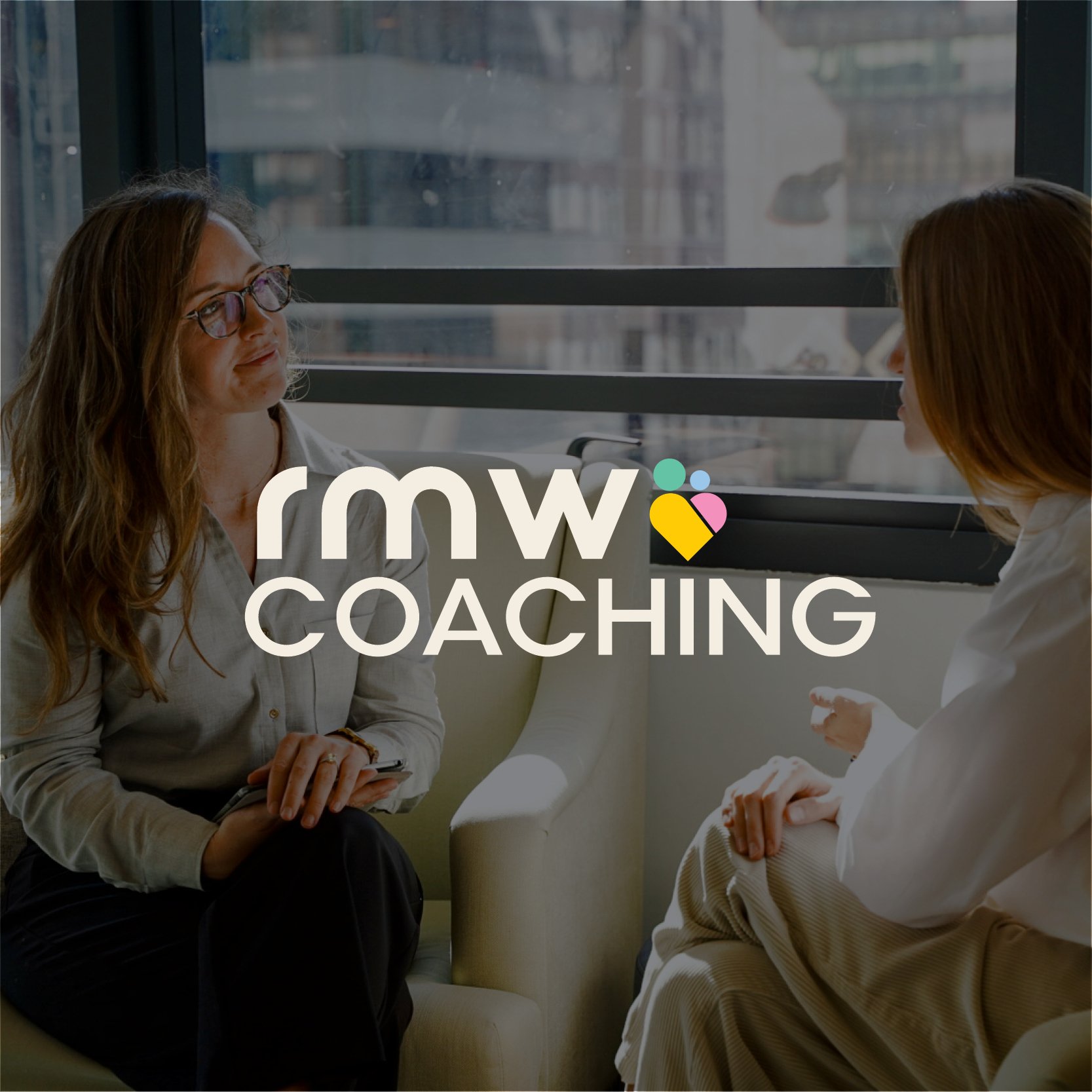
We made use of a variety of design techniques to transform the RMW Coaching identity from a simple and generic logo, into a confident and energised, yet still welcoming and empathetic brand.
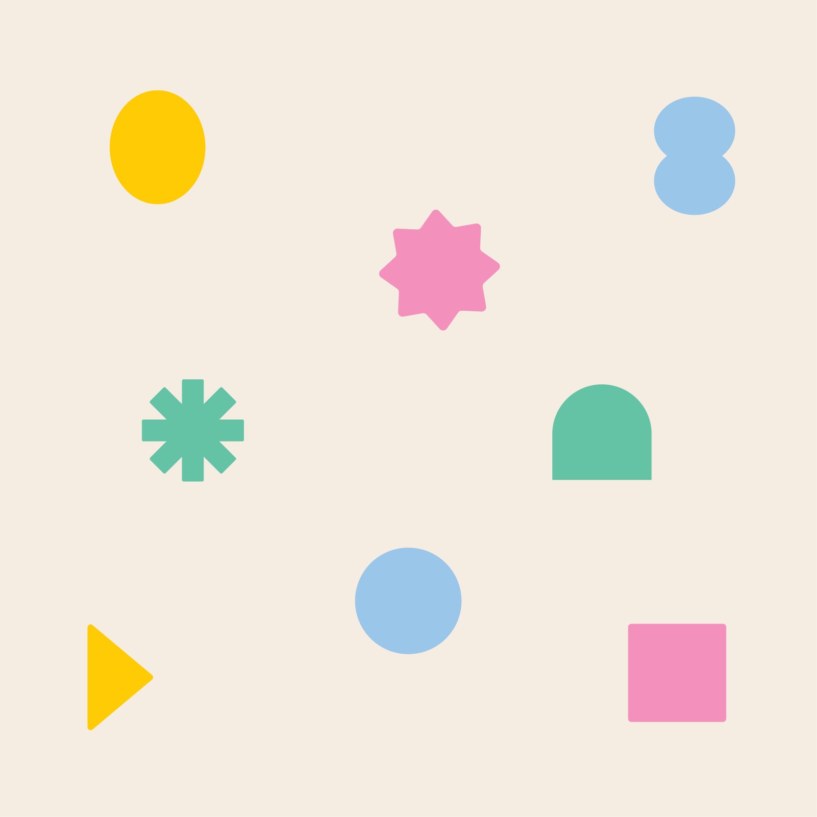
Typography - a highly rounded primary typeface gives the brand an approachable feel, which is further reinforced through the use of lowercase letters
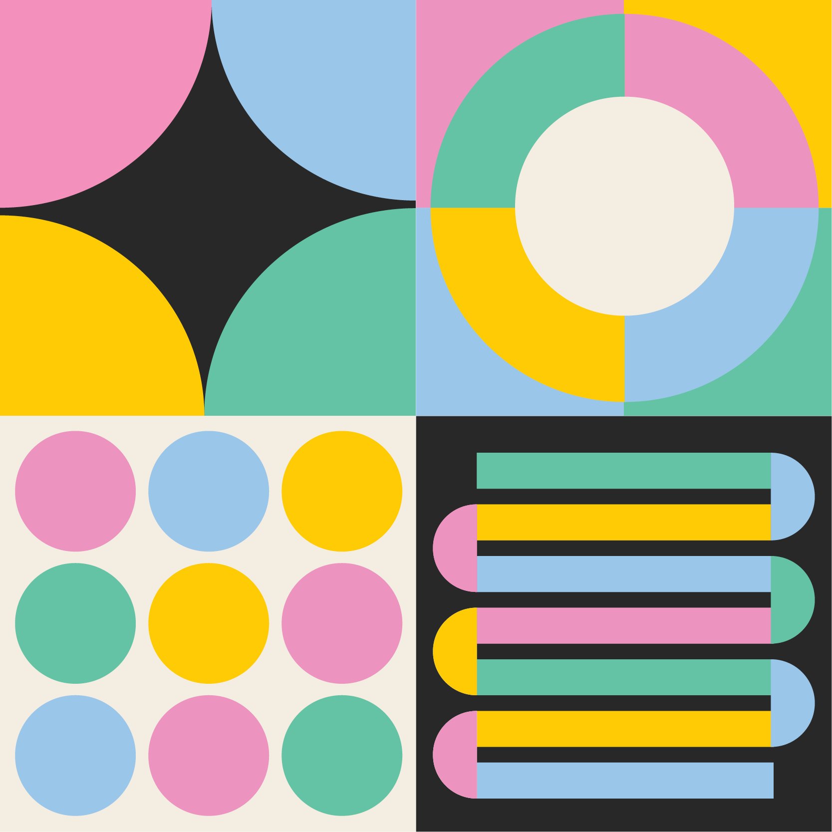
Colour - a bright and colourful palette adds energy and vibrance to the brand, but the use of more pastel tones ensures it did not become too overpowering or assertive
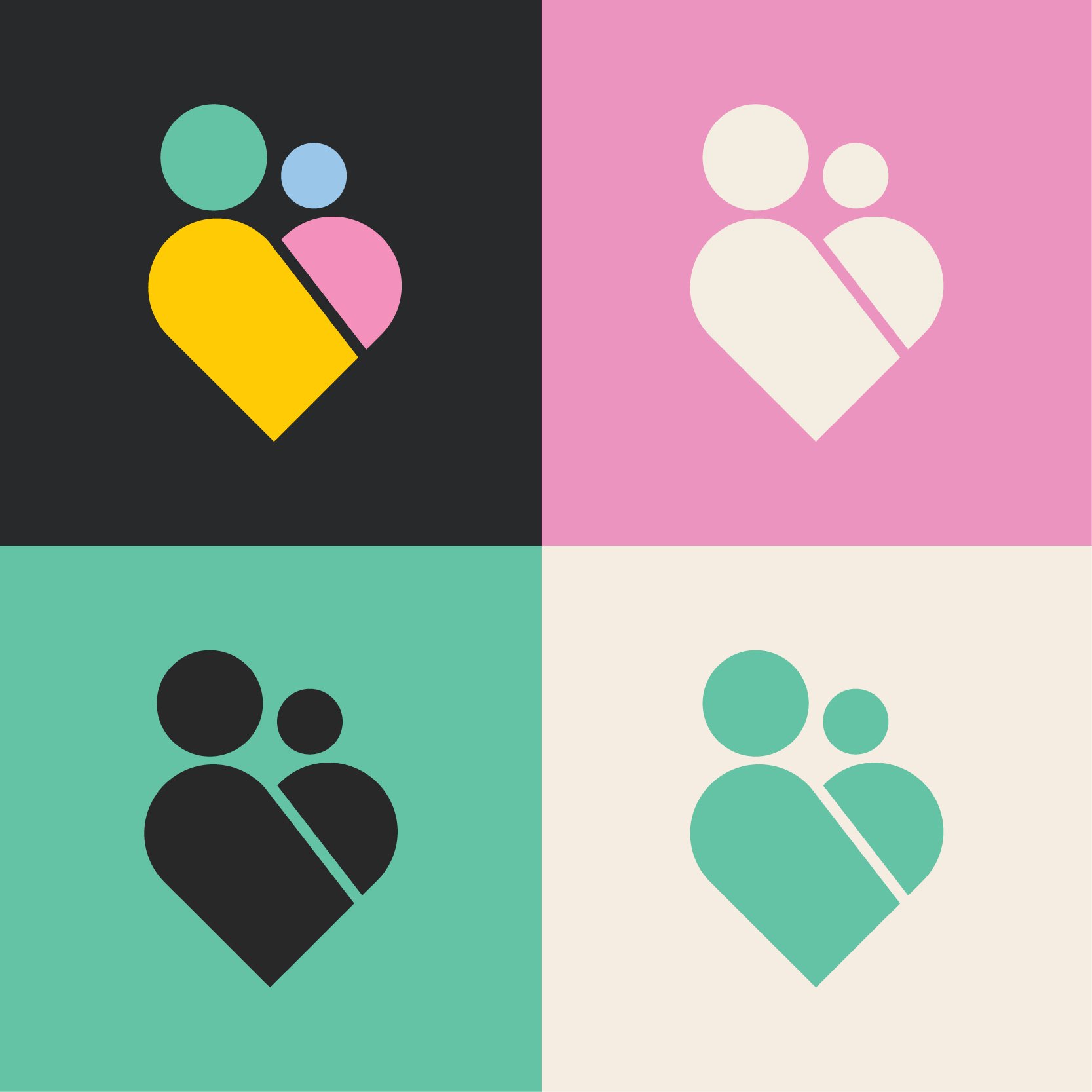
Shape - the use of simple shapes in the brand icon, as well as in the supporting graphics adds a playful, and almost child-like feel to the brand, in a sophisticated way. This gives the brand a friendly feel and helps appeal more directly to the target audience of mothers, and mothers-to-be
In addition to the primary and secondary logos, we developed 2 icons to help differentiate between Rebecca’s individual and corporate offerings. A set of brand shapes were also developed, to allow Rebecca further flexibility in communicating the varied facets of her services.
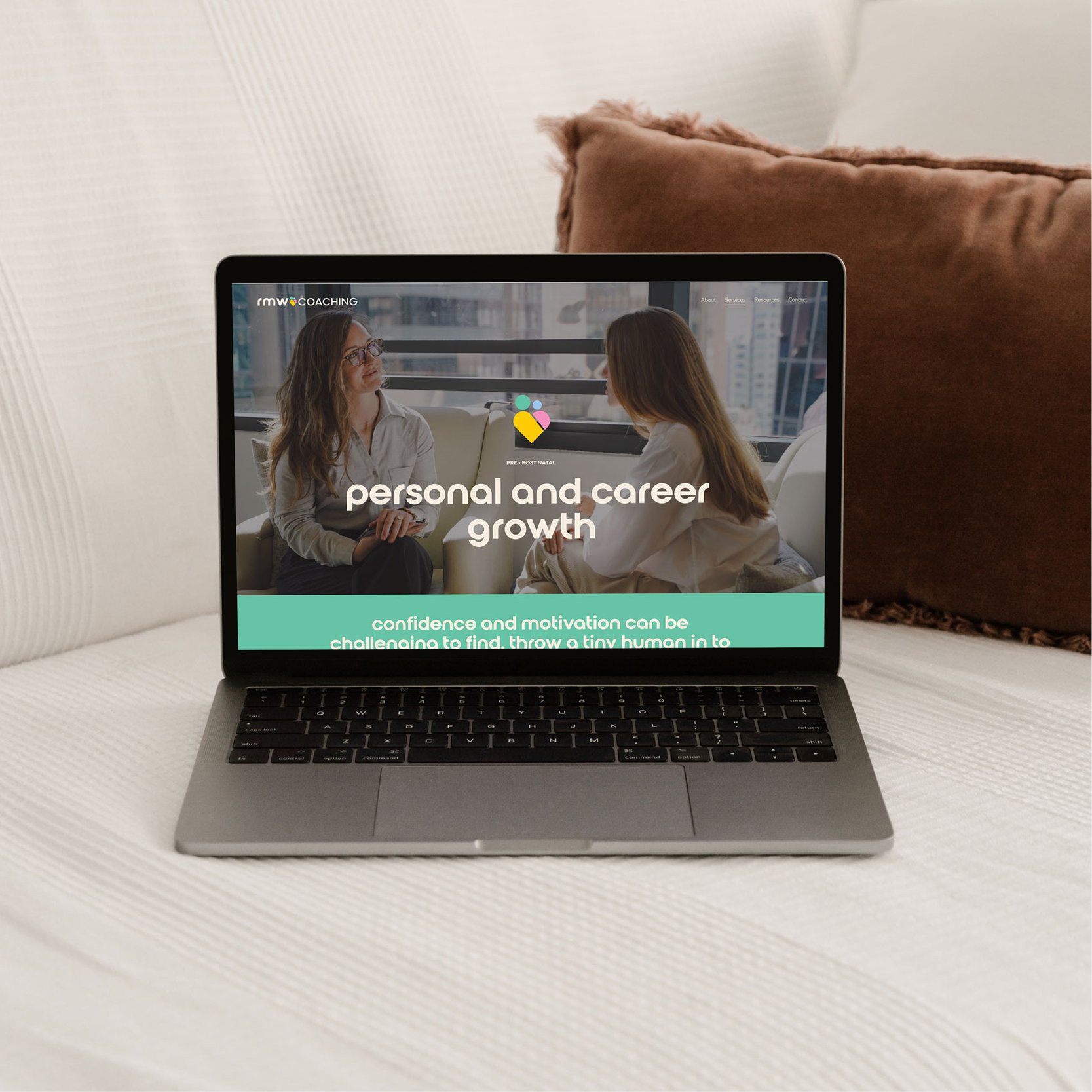
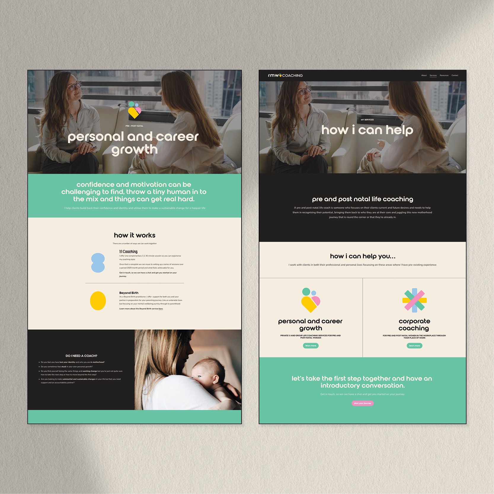
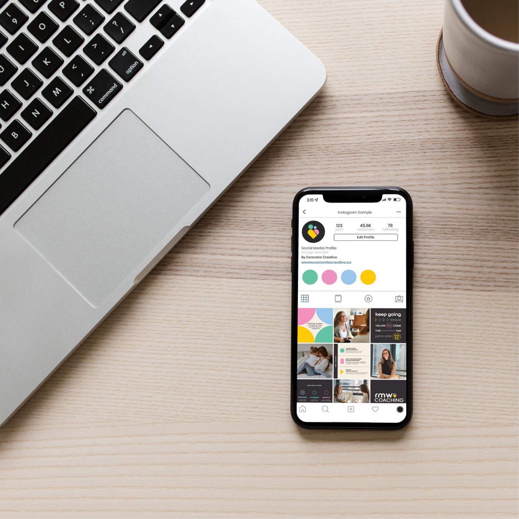
After establishing such a comprehensive brand kit, we were able go on to design and develop a Squarespace website that attracts and appeals to Rebecca’s ideal clients.
What We Made
Brand Identity
Social Media Templates
Squarespace Website