
Portfolio
Earth Restaurant
Showcasing the finest Riverland produce with people who share a passion for food and an appreciation for the land it all comes from.
Project Overview
Industry
Food & Beverage
Location
South Australia
Deliverables
• Branding
• Brand Collateral
The business
The mission of Earth Restaurant was simple; to create and innovate a local dining experience, to share the finest Riverland produce with people who love good, honest food.
the CREATIVE DIRECTION
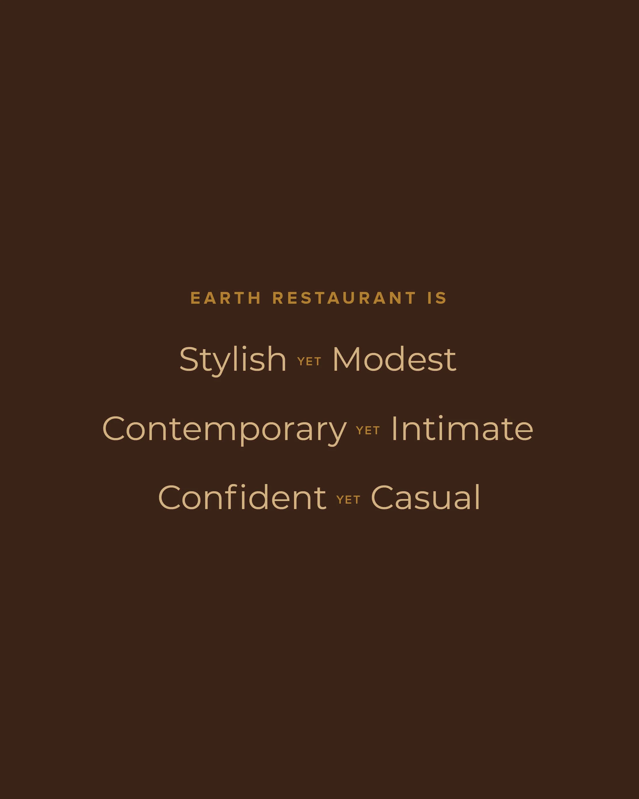
Honest yet Refined
Authentic yet Innovative
Local yet Distinctive


Case study
The Making of Earth Restaurant
The Business
I was introduced to Peter, founder of Earth Restaurant, through a mutual friend (and past client) — Scott from SMFA. From our first conversation, I was drawn to Peter’s vision: to create a truly local dining experience that celebrates the finest Riverland produce and shares it with people who love good, honest food.
Peter’s ethos was all about simplicity done well — authentic, local, and high-quality. He wanted to showcase the incredible produce of the Riverland while honouring the land it comes from and the people who grow it. Earth Restaurant would be a place that felt grounded and genuine, but still refined — an elevated dining experience without pretence.

The Design Process
The brand needed to embody Peter’s ethos: honest, authentic, and local, while still reflecting the restaurant’s elevated dining experience. It couldn’t be too rustic or casual - balance was key.
We achieved this through carefully considered colour, typography, and iconography.
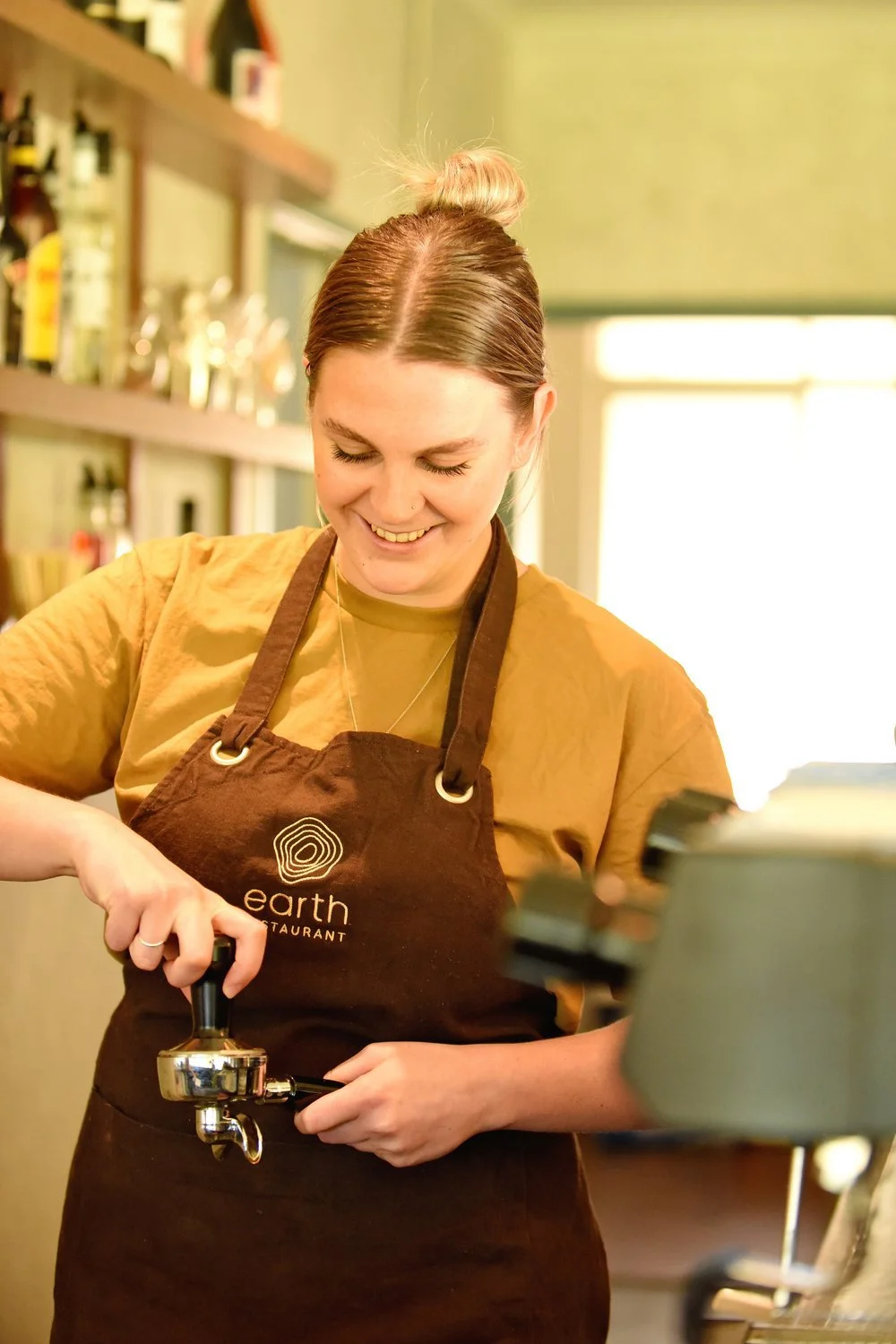
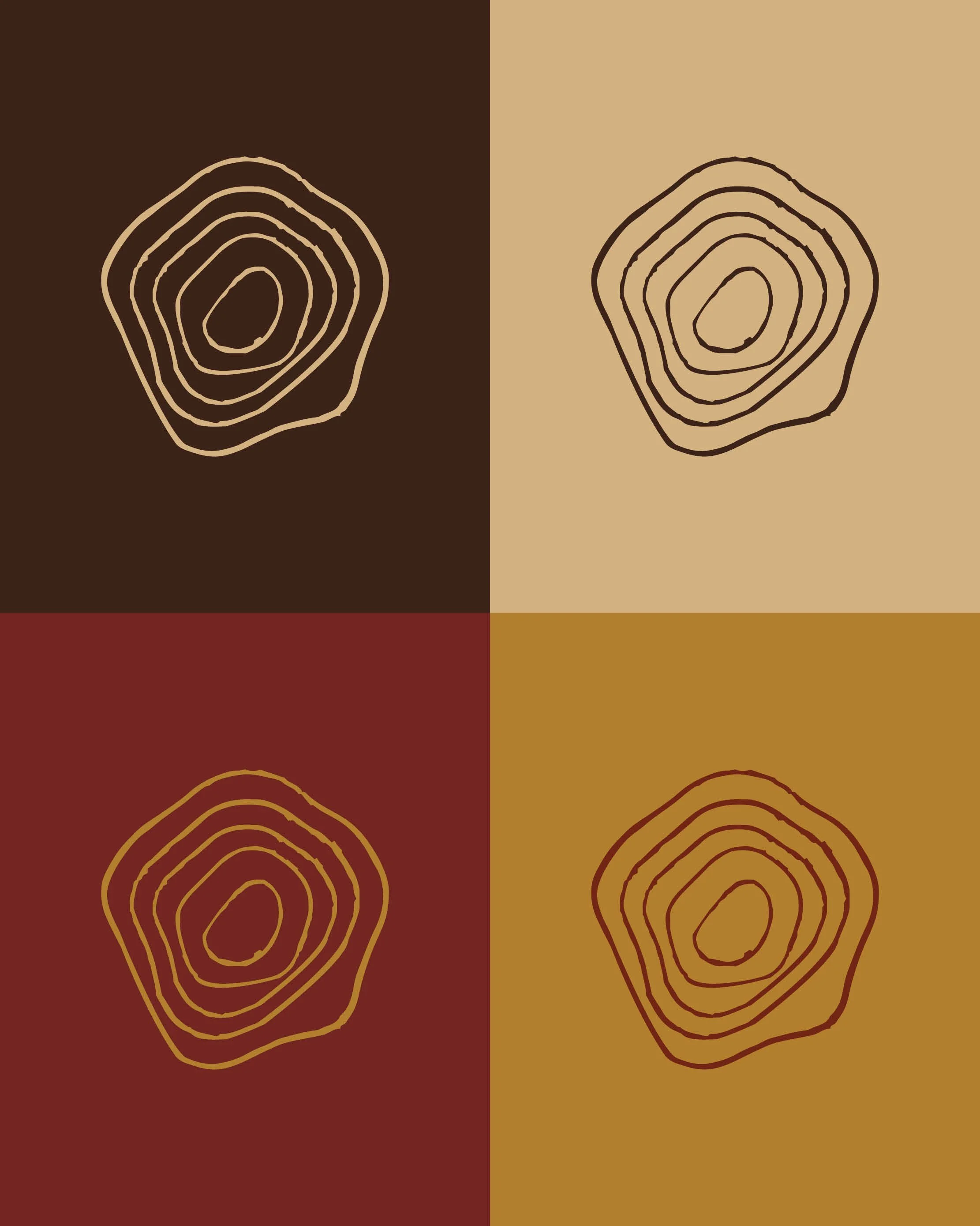
The colour palette began with earthy tones; rich chocolate browns and soft sand to reflect the Riverland landscape. To elevate the look, we paired these with touches of gold and copper, bringing warmth and sophistication.
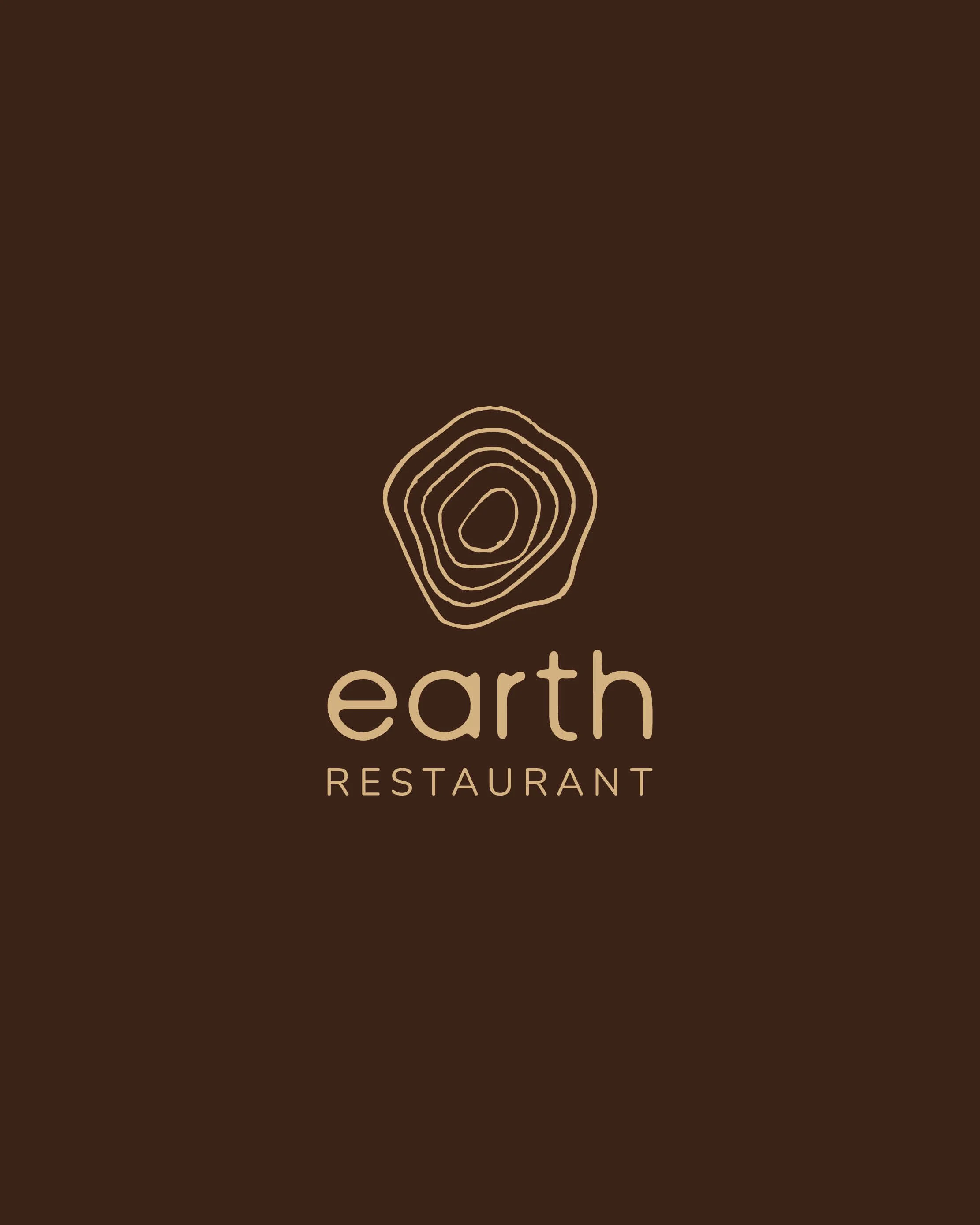
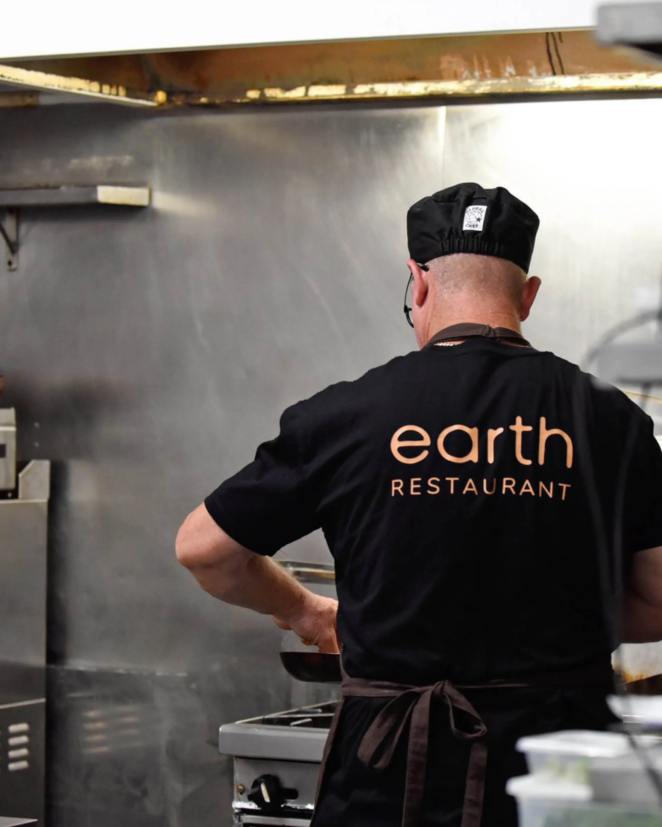
For typography, I sourced a hand-drawn sans serif font that felt organic yet modern. It gave a crafted, human touch without leaning into “country café” territory. The use of lowercase for ‘earth’ reinforced approachability and warmth, while the uppercase ‘RESTAURANT’ balanced it with professionalism and structure.


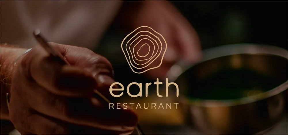
The brand icon was designed to be distinctive and versatile — something that could appear seamlessly across signage, menus, uniforms, glassware, and more. Inspired by topographic lines, the mark represents the local landscape — the earth itself — and the connection between land and food. The circular, slightly hexagonal shape evokes inclusivity, community, and the natural cycles of the environment.
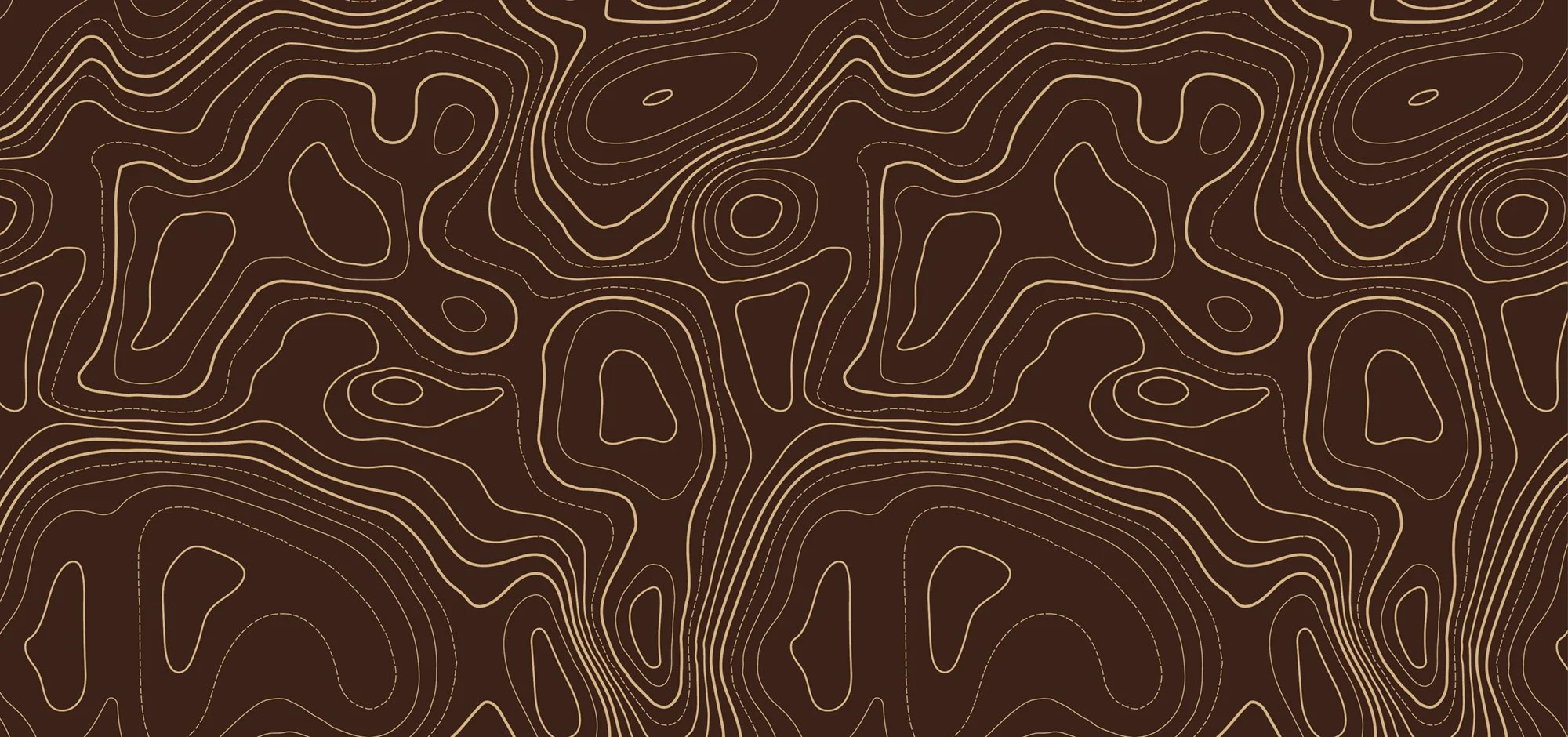
To complete the identity, I developed a brand pattern derived from simplified topographic linework. When paired with the earthy palette, it created a striking, grounded aesthetic that tied every touchpoint together beautifully.
The Result:
With a complete and versatile brand kit, Peter was able to confidently roll out the Earth Restaurant branding across every element of the business.
I helped design a simple yet elegant menu that could be easily updated in-house — essential for a venue where the offerings change seasonally based on local produce.
From there, Peter took the reins, applying the branding to signage, uniforms, coasters, and even glassware. Seeing it all come together in the finished space was incredibly rewarding — the brand felt as warm, grounded, and refined as we had envisioned.
Earth Restaurant is now a thriving destination, offering locals and visitors alike the chance to experience premium food and wine that champions the Riverland’s best producers — all within an atmosphere that truly reflects its name.