
Portfolio
Padeldogs
Home of the Elite Padel Rackets. Discover the Finest Independent Padel Rackets from Spain, Portugal & Italy. Delivered from the Heart of Sussex.
Project Overview
Industry
E-commerce, sporting goods
Location
Sussex, United Kingdom
Deliverables
• Branding
The business
Born from a passion for Padel, and the love of a pup - PadelDogs is a premium online retail platform bringing the finest independent padel rackets from Spain, Italy and Portugal to the UK.
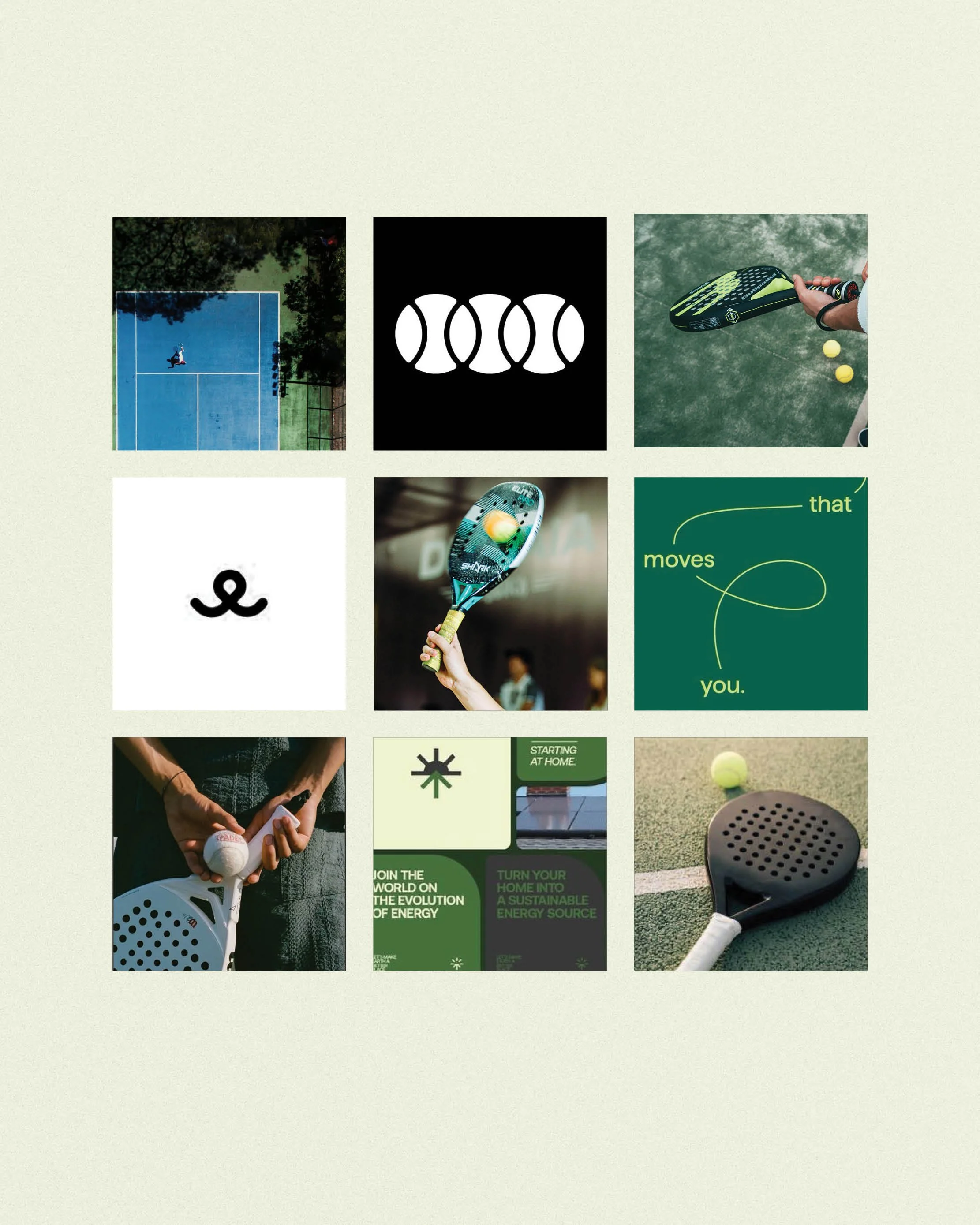
the CREATIVE DIRECTION
Dynamic yet Sophisticated
Exclusive yet Welcoming
Innovated yet Dependable

Case study
The Making of Padeldogs
The Business
They say you shouldn't work with friends... but I couldn’t have been more excited to help PadelDogs founder, (and friend!) Sam, bring this idea to life. Noticing a gap in the market for a boutique-style premium padel racket retailer in the UK, Sam put wheels in motion to make the most of this opportunity; fast. Within a few short months, he had conducted extensive research, attended Padel conferences, and established a number of international wholesale relationships.
Then, he reached out to me (Lanz), to create a face for the business, and craft the brand’s identity…
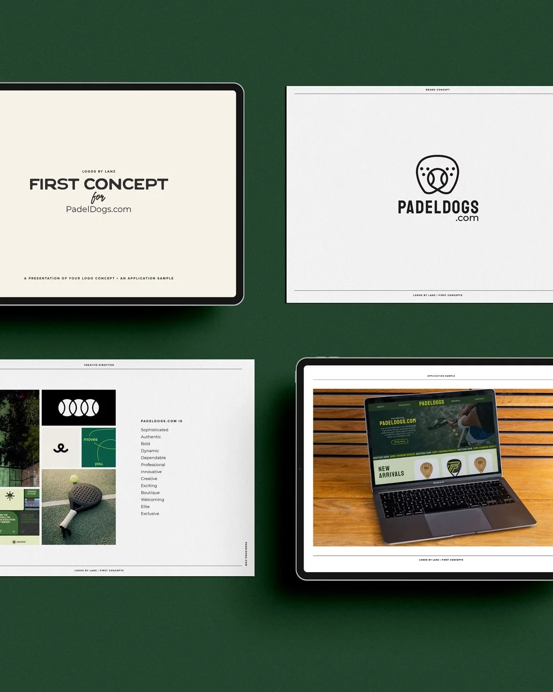
The Design Process
Sam chose the Logos by Lanz Branding Basics package, which meant just one logo concept would be delivered. The fact Sam had already put a whole lot of groundwork into the business before the design phase, made my life a lot easier!
For me, the brief came down to two things:
The brand had to feel dynamic yet premium; like it belonged in the sporting world, but with a boutique feel
It needed a clever nod to the “dog”; I wanted to subtly show this connection, without being gimmicky.
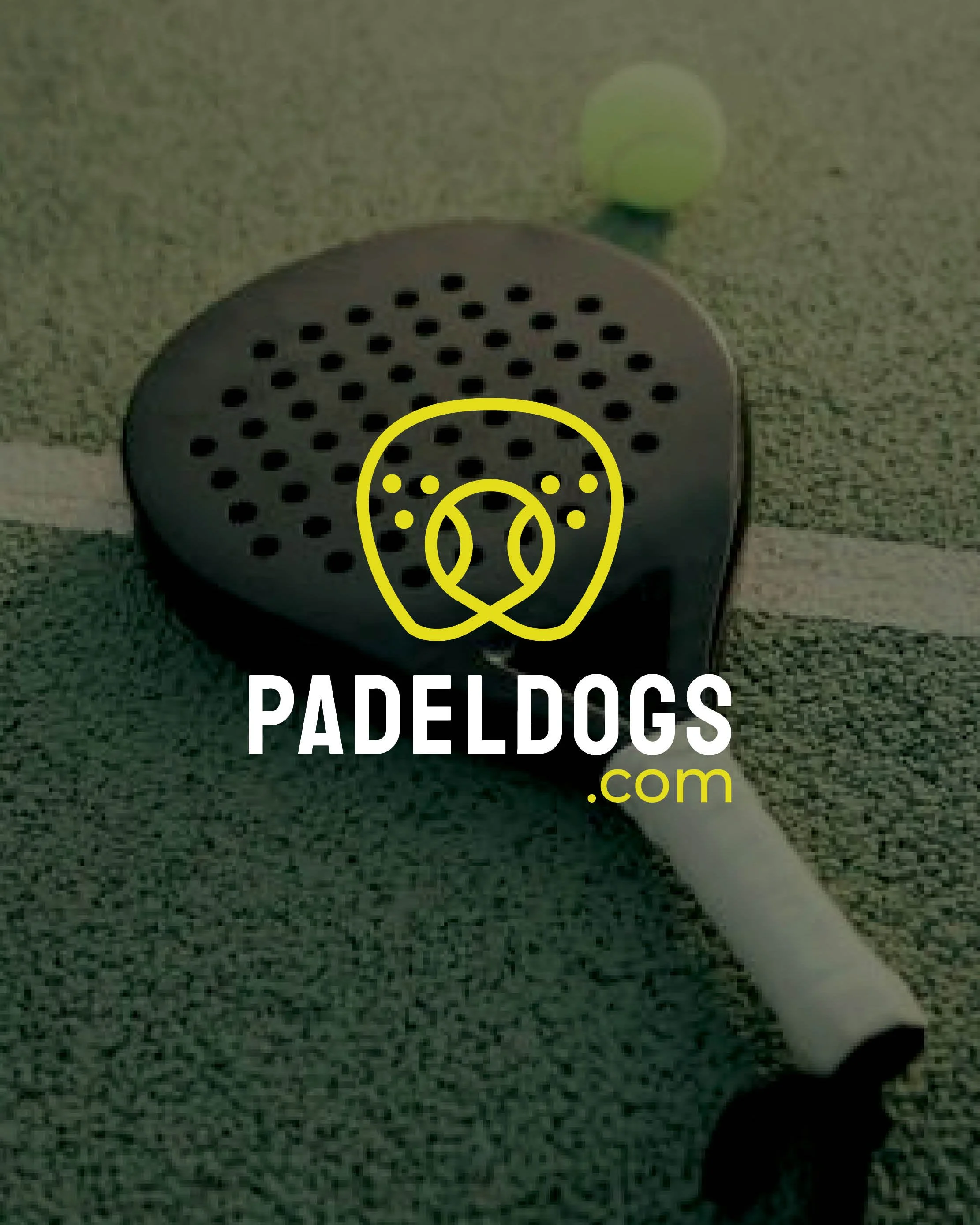
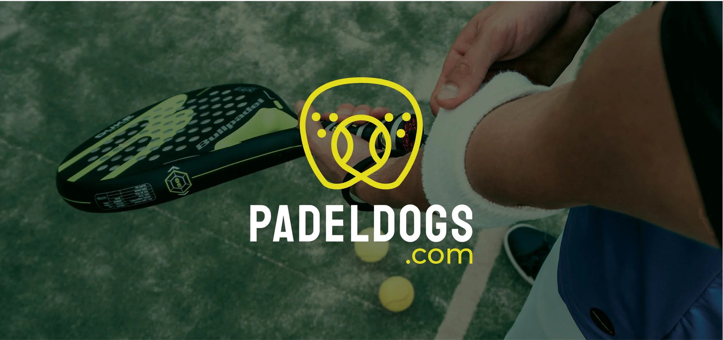
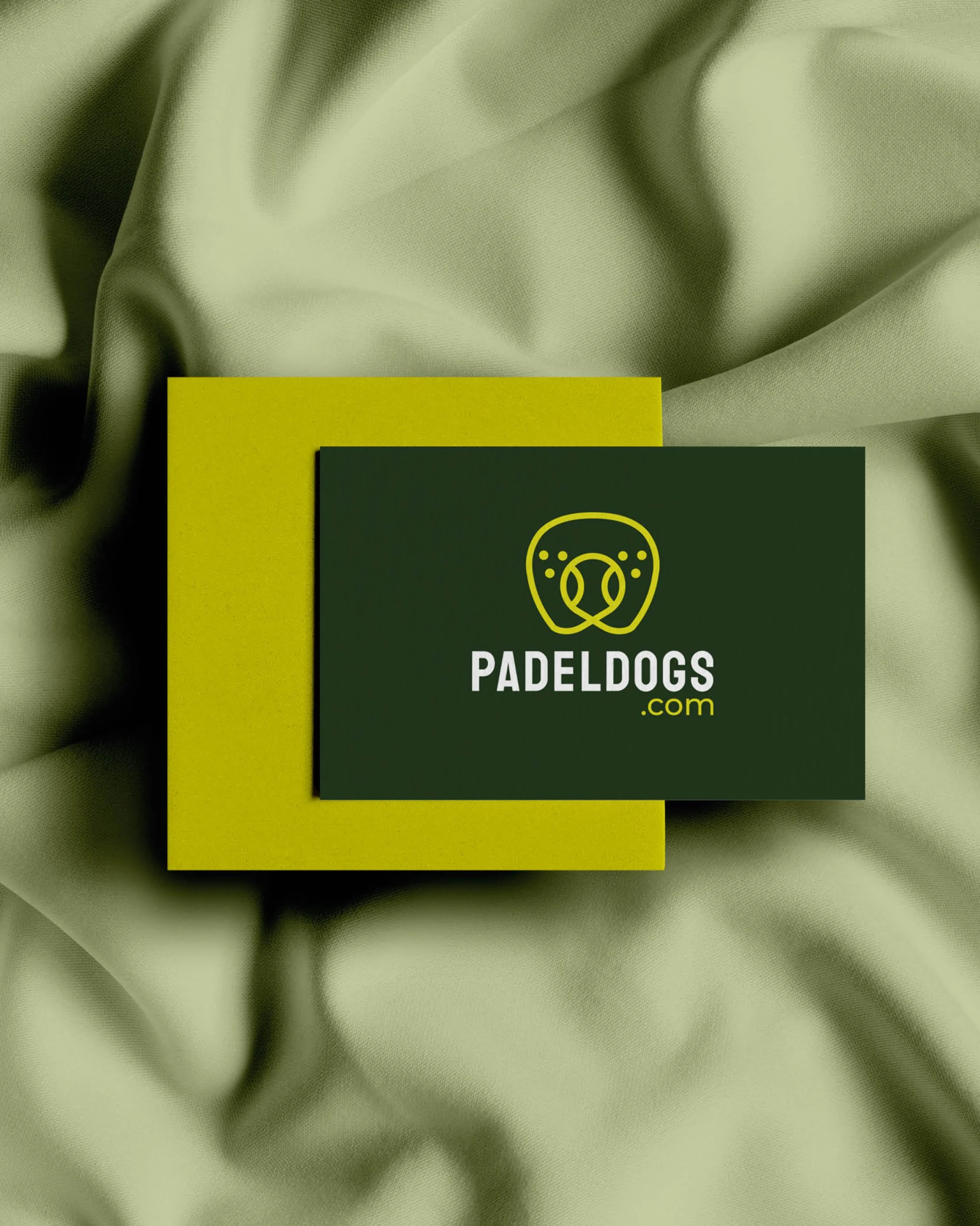
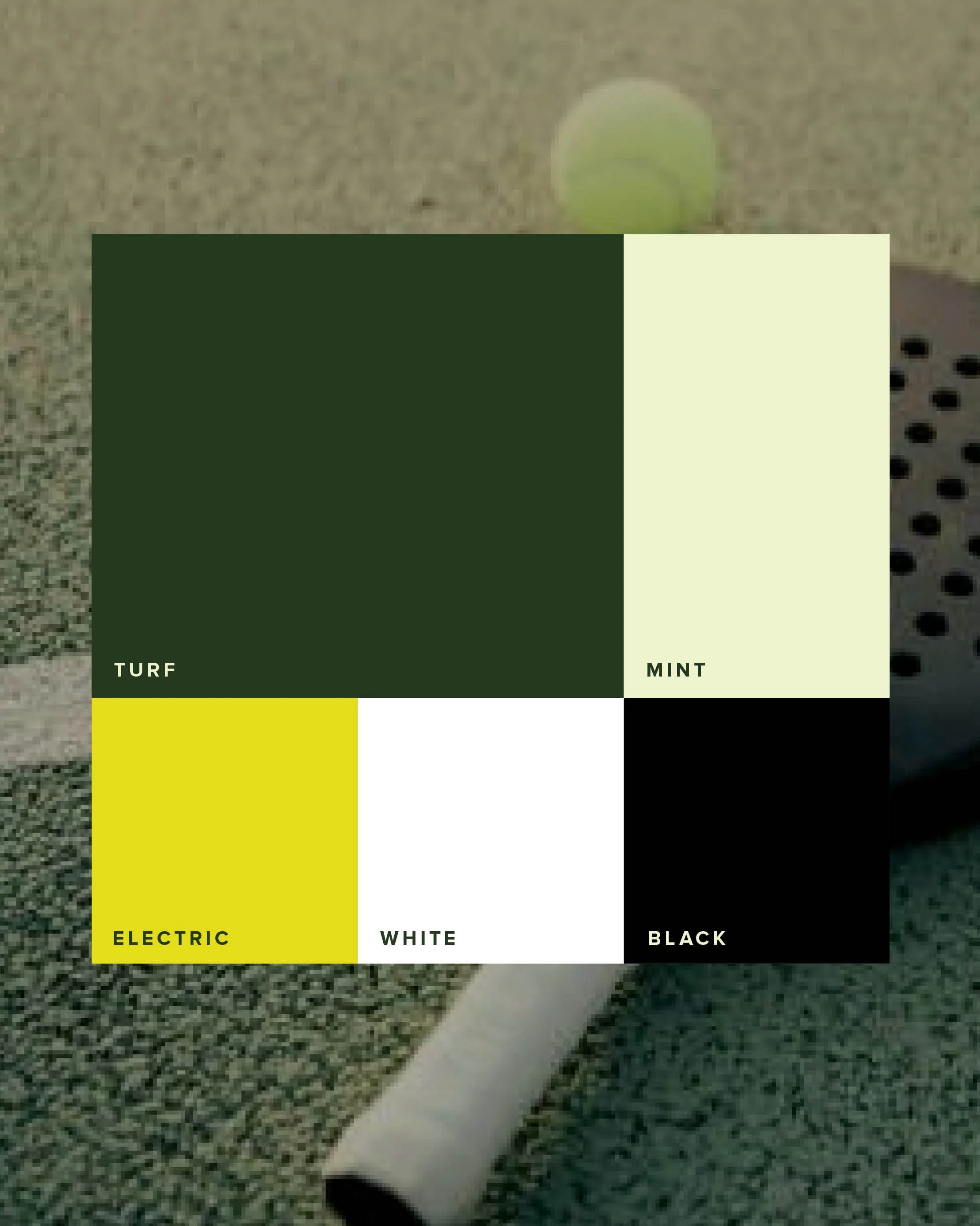
I opted for bold and clean with the typography; giving a dynamic, yet refined feel. The colour palette mirrored this essence, pairing a luxe dark green with a vibrant lime accent colour. Although the “tennis ball yellow” hue may seem obvious and potentially overdone; it was a considered decision - we needed to very clearly connect the brand to padel (and sport in general). The use of this iconic colour means potential customers are less like to mistake don’t mistake Padeldogs.com for a dog brand!
Lastly, the absolute hero the brand, the icon. I wanted to visually show the connection to the fun business name, without it feeling crass or gimmicky. In the scamping process, I realised there was (very conveniently!) a strong connection between the shape of a padel racket and a dog snout. With a bit more workshopping on screen, I was able to develop a distinctive, clean and minimalist line icon that very literally communicates Padel + Dog.

The Result:
Sam immediately loved the concept. Within 2 weeks, we created a bold, dynamic, premium sporting brand — with a clever nod to the name to make it truly distinctive.
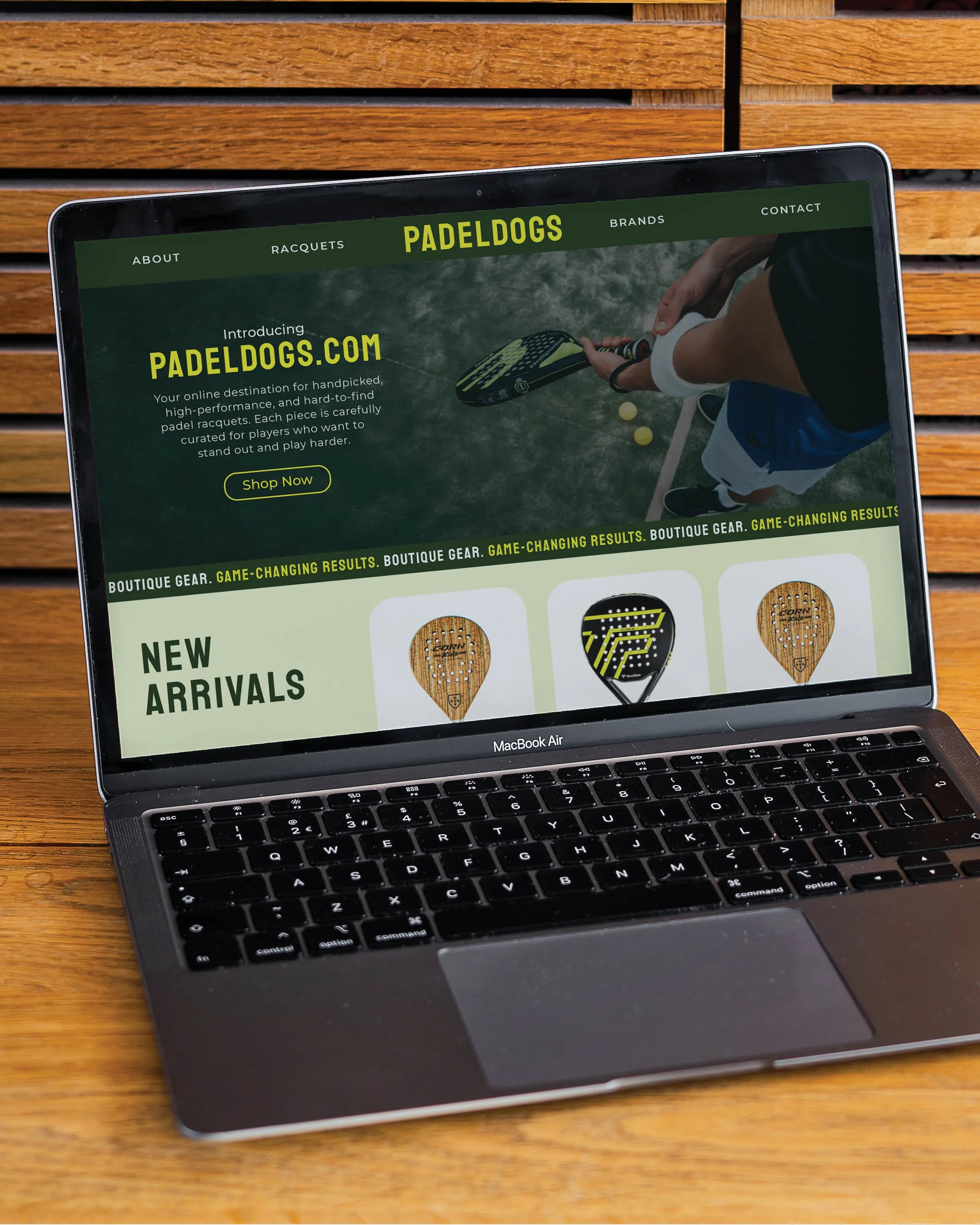
Sam used the website mockup I shared in his logo presentation as inspo for building his own Shopify site. My Branding Basics Package then armed him with all the tools (logos, colour codes, fonts, and a brand board,) needed to launch his on-brand site and start making sales, pronto.